
Friends often ask me how they might start painting abstract because it feels so intimidating to them. I started to think back to my art experience and found that I have 10 tips to help jump start any 2D creative abstract project. Here is Tip 1 out of 10 for "How to Jump Start Abstract Paintings Practice."
Whenever I introduce myself as an artist, an abstract painter, most people's eyebrows go up. Some folks are intrigued while others are intimidated. And they may follow up with a question if they are interested in what abstract style but for the better majority, they nod and exclaim how "cool" or "interesting" that is.
If they are familiar with art or artists themselves, they might ask "What medium do you work with?"
I get it. I totally do. It took me almost a decade out of college to declare myself an artist, let alone an "abstract painter." I've been there and thought many of the same self-limiting beliefs as most people when they are faced with any other creative person in their life. I could never do that!
We simply say, "well that's so cool... but I could never do that!" "I'm not creative," or "I tried art but was so bad at it." Or I could "never do what you do," or even "I love art and painting and drawing, but I could never do abstract."
I do the exact same thing too actually. Like my son's teacher confiding to me that she loves baking cakes and in fact, last weekend, she completed a wedding cake for her niece. I saw the photo. It was Martha Stewart worthy. AMAZING.
I could never do that.
BUT, I started the exact same way with painting. And what was interesting to me was way back when after college, I had sensibly declared myself a graphic design major so that it would be practical and useful. I had a corporate job in a commercial real estate company downtown in Chicago, creating brochures, fliers and proposals for the brokers.
But I started dreaming of painting in an abstract style.
I could draw from my lessons as a kid, and I sensed that I might be able to make that jump into total abstraction but I didn't know how to get there.
It wasn't until I was on my first day of graduate school, in my masters program at Eastern Illinois University, that my professor gave me the strategy I didn't know I needed, to help me make the jump.

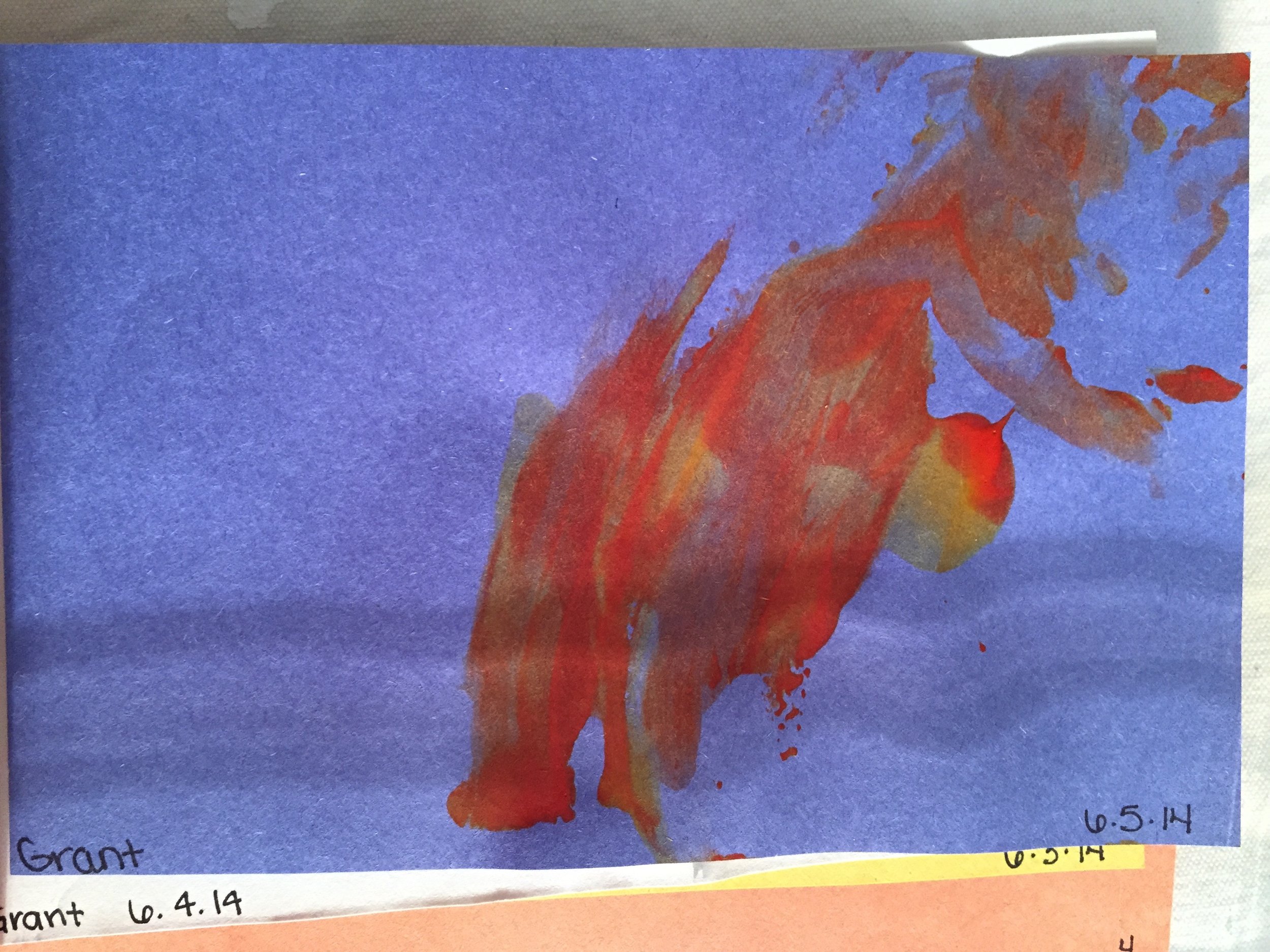
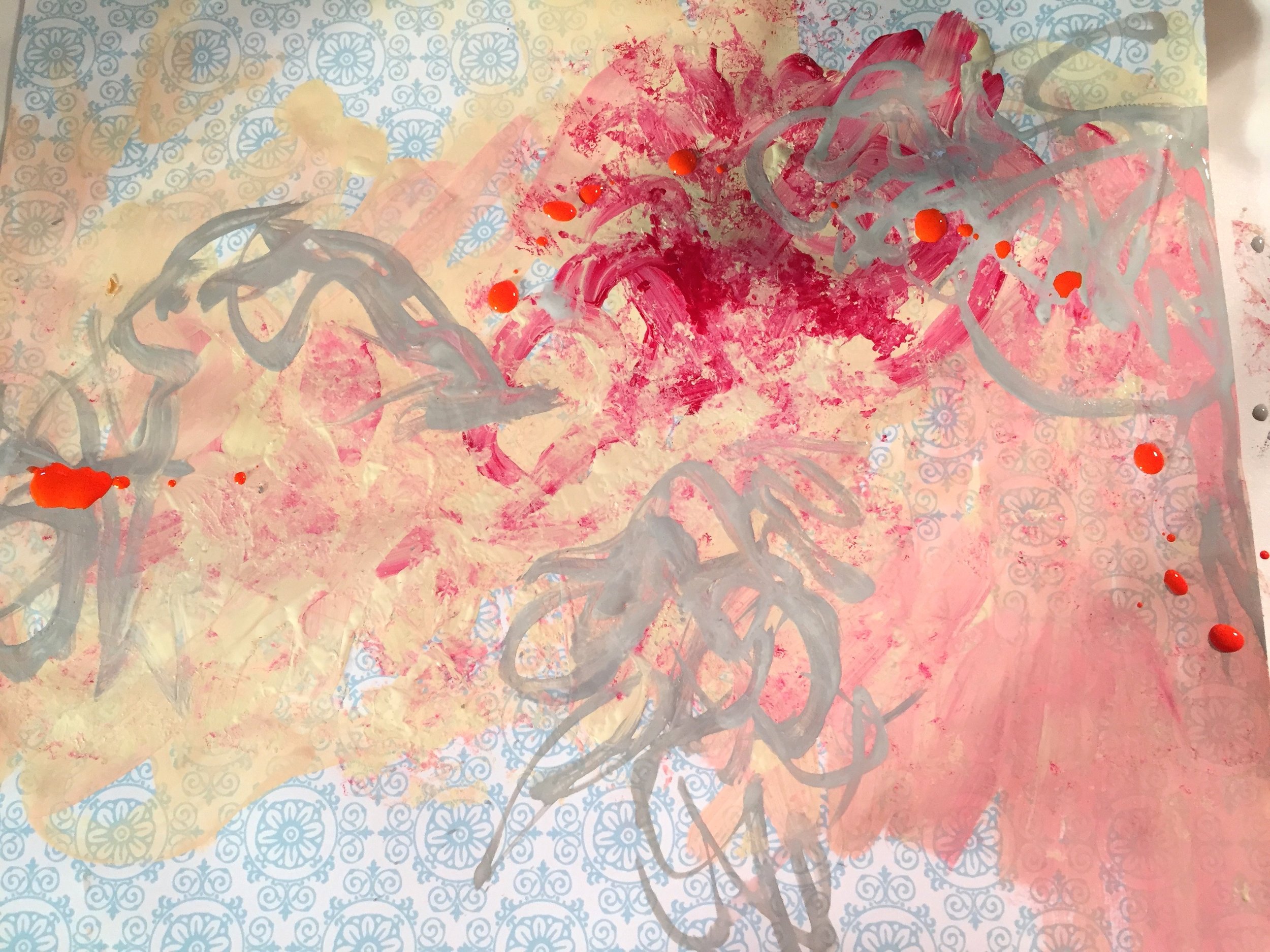
My very first “ugly” painting circa Sept 2007. © 2007-2018 Kathryn Neale Studio
Paint ugly paintings.
What?
Yes, it's that simple: paint the ugliest painting you could imagine.
First off, I do want to be clear that this is NOT subject matter. This is still "abstract." It's not vulgarity that is liberating it frees oneself from constantly thinking that this "has to be beautiful" in order for it to be a legit painting, especially an abstract painting.
Abstract painting is relatively brand-new within the context of our entire human history of making art. But for our generation, abstract painting has been around actually a long time, most of us, established before we were born.
Looking back to my first day in art school, I realized this was a brilliant strategy. As a novice painter, this simple exercise challenged everything about what I thought was "beautiful." Beauty is such an enormous philosophical subject that could be argued, has been the debate since the time of the Greeks, who were the first to classify what is and what is not beautiful (especially in the West). It can also be argued that the notion of beauty, what is beautiful, is subjective. But I would fervently argue that we, both men and women, have inherent constructs of beauty, expectations and standards ingrained in us from culture and society, and most of them we don't even think about or challenge what definitions of beauty we are thinking about and why.
This exercise breaks down that internal rhetoric and gives permission to set aside those thoughts like "is this pretty or beautiful? Or this "doesn't look right," and instead allows us to freely explore abstract elements in their most formal aspects.
I have found that every single painting that I work on, currently and in the past, stem from this simple dialogue with myself, where I'm feeling that most of my paintings are in "Ugly Duckling Phase," 90% of the time until the very end.
It's actually simple to flip an ugly painting into a nicer "pleasing-looking" one. The challenge is making an ugly one in the first place so that there's a lot of interesting things happening in that painting to keep our interest.
But this is also about mindset. There are no expectations. There's no one giving you a subject matter to copy from or for you to know even where you are going with certain elements. If it's ugly, that's the point!
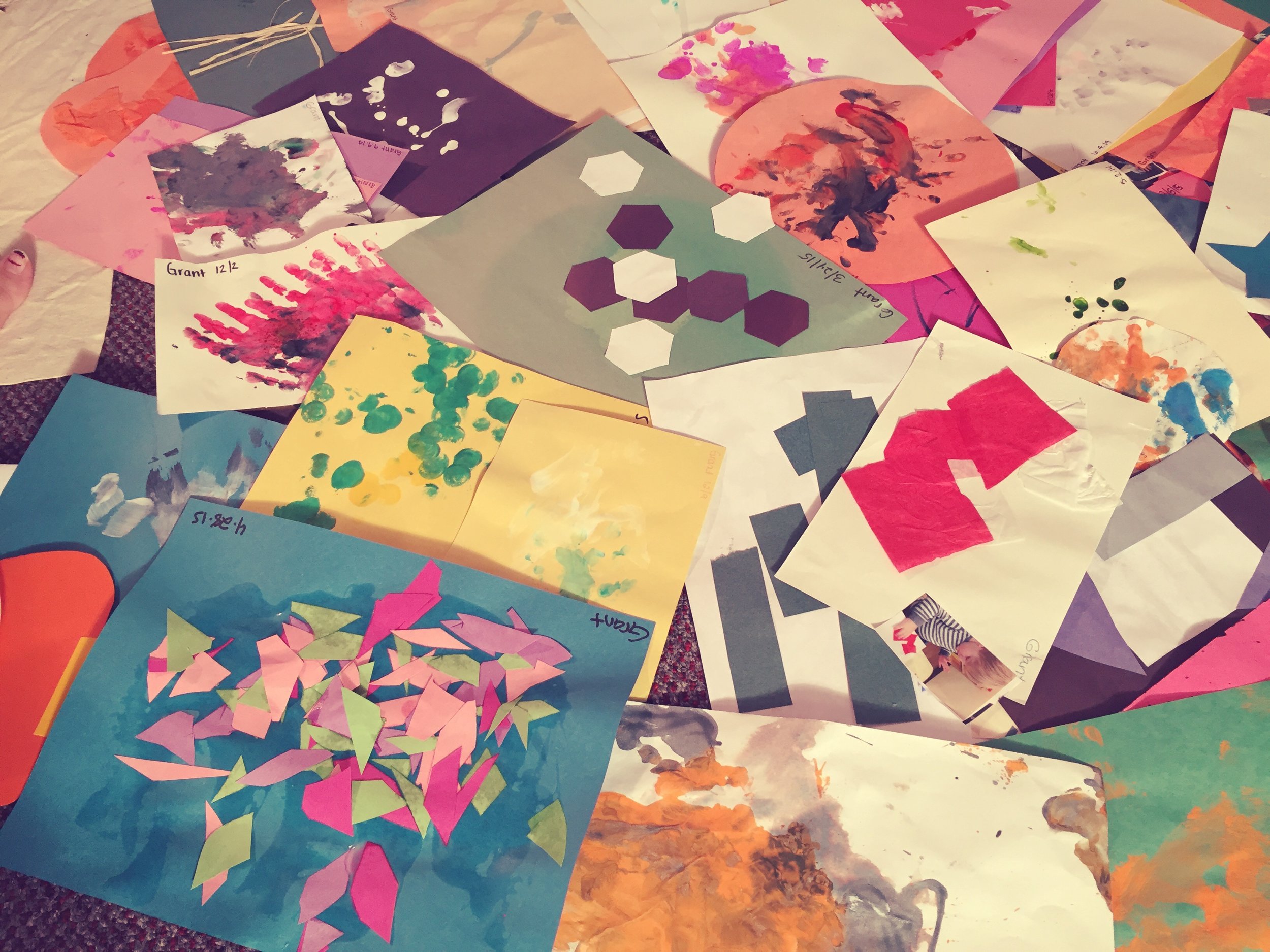
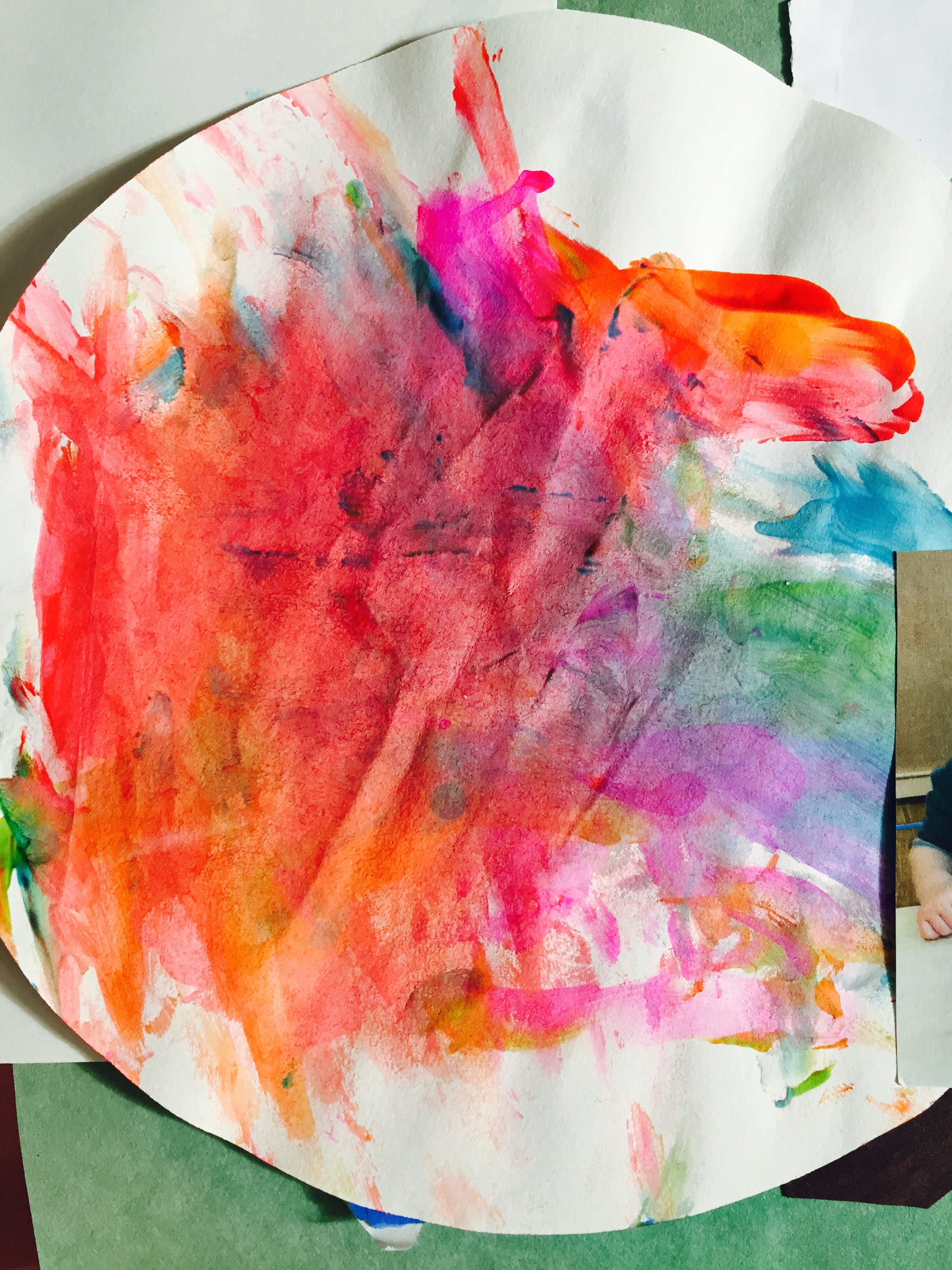
And... ANYONE can do this. Anyone can make an ugly painting. My seventh-month old technically can make an "ugly" painting. And for sure some of my favorite paintings are when my oldest son was two years old. He grabbed paint brushes and smeared paint on the paper with abandoned curiosity and a ferocious confidence. And of course, the result is that I have found tremendous beauty in those pieces.

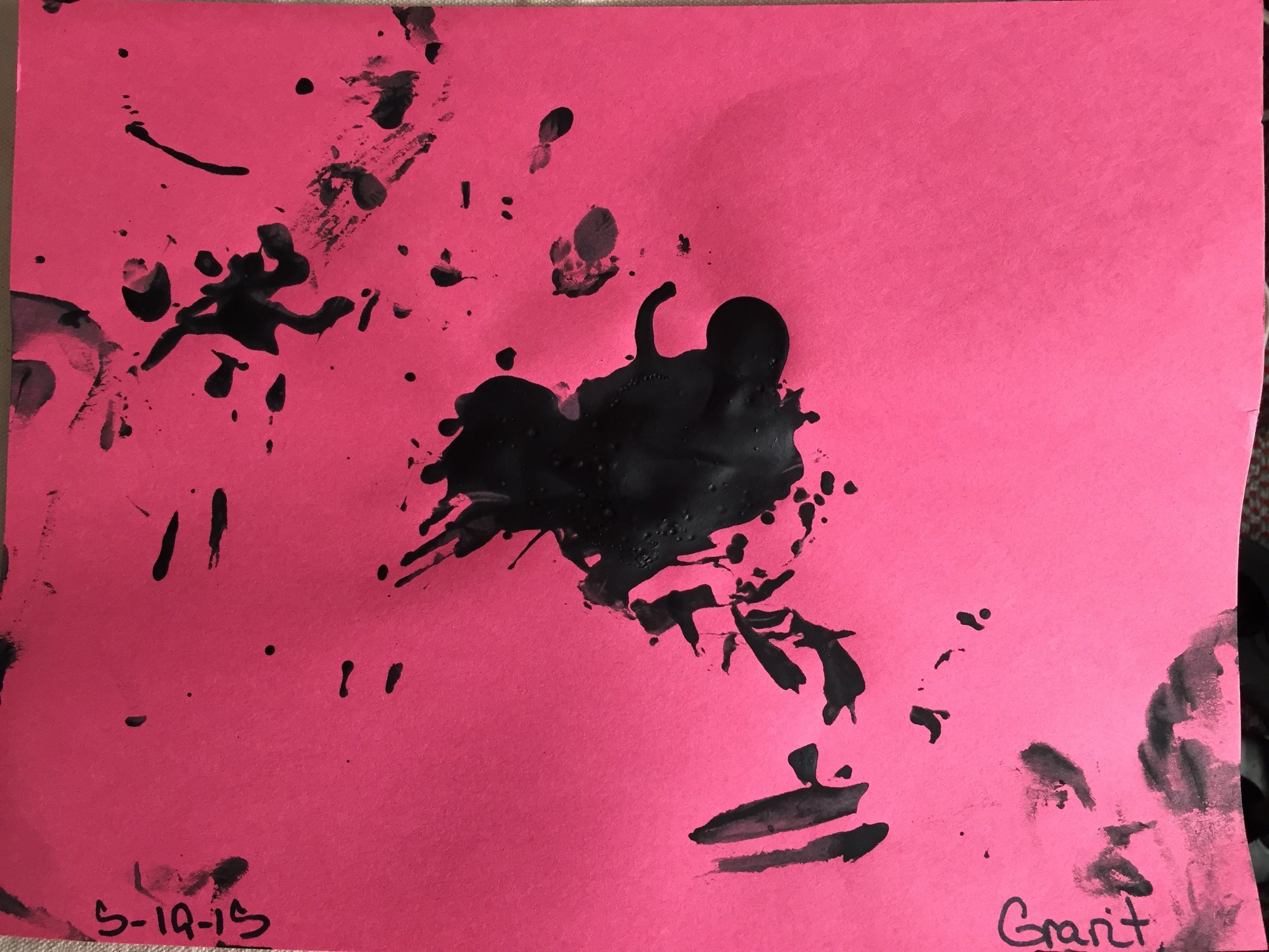
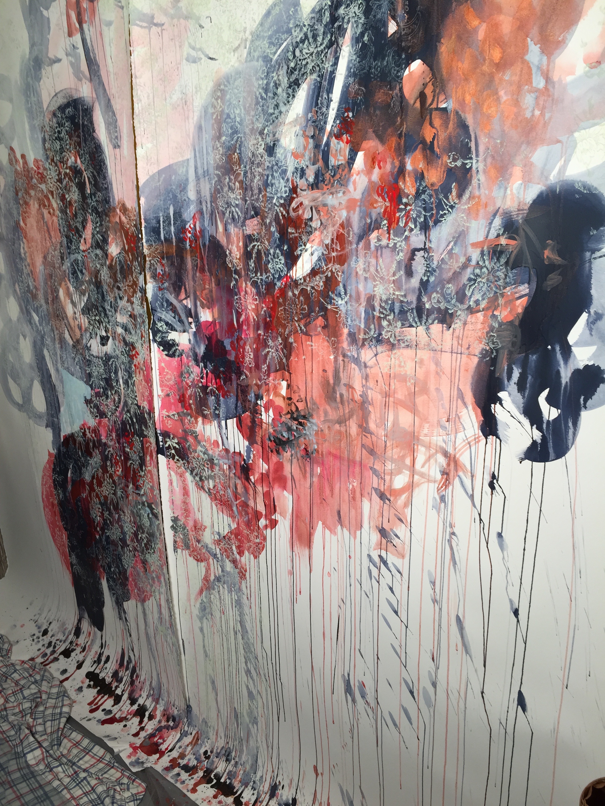
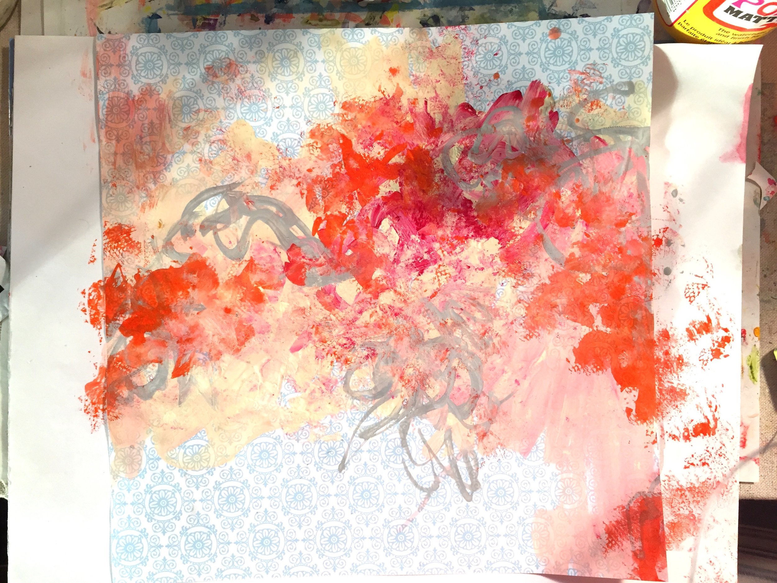
In process painting, circa Sept 2007. © 2007-2018 Kathryn Neale Studio
So a few tips for painting "ugly:"
Permission. Give yourself permission to paint the ugliest thing you've ever seen. This is your chance to not care about what anyone else thinks. Not even care what you think! Give yourself permission to jump in and simply not think at all, just react and go with your impulses.
No right way. The worst mindset you can have is to think there is only a "right way" to paint. This style of abstract painting is often called "freestyle" or "intuitive painting." The ugly part gives your mind a break. It gives you 100% permission to try everything just to see if it works. If not, then it works as an "ugly" part of your painting. The decisions you make are more aligned with your intuition than your head. And for most of this process, we definitely want to stay in the intuitive part of the brain, not the critical part (there's a time and a place for that but it's not now!)
FREEDOM! This style of painting is MESSY. I will say over and over if you are uncomfortable, you are on the right path! I’ve also found that 90% of working on a painting through its various stages is plain “UGLY.” I once had my graduate professor exclaim that every time she came into my studio she thought I was working on the ugliest stuff, but then all of a sudden she would see it comes together in the last stages and is actually aesthetically pleasing. And this was her way of complimenting me!
No mistakes. Remember, this is just a painting. You can paint OVER IT. And OVER IT. And OVER IT AGAIN. I know you won't believe me but there really are no mistakes in painting.
Private vs public. Also remember, NO ONE HAS TO SEE THIS. This just for you. (Unless you want to). No one cares. Like AT ALL. No one even knows you're painting an ugly painting! So give yourself a break! And don't expect a masterpiece.
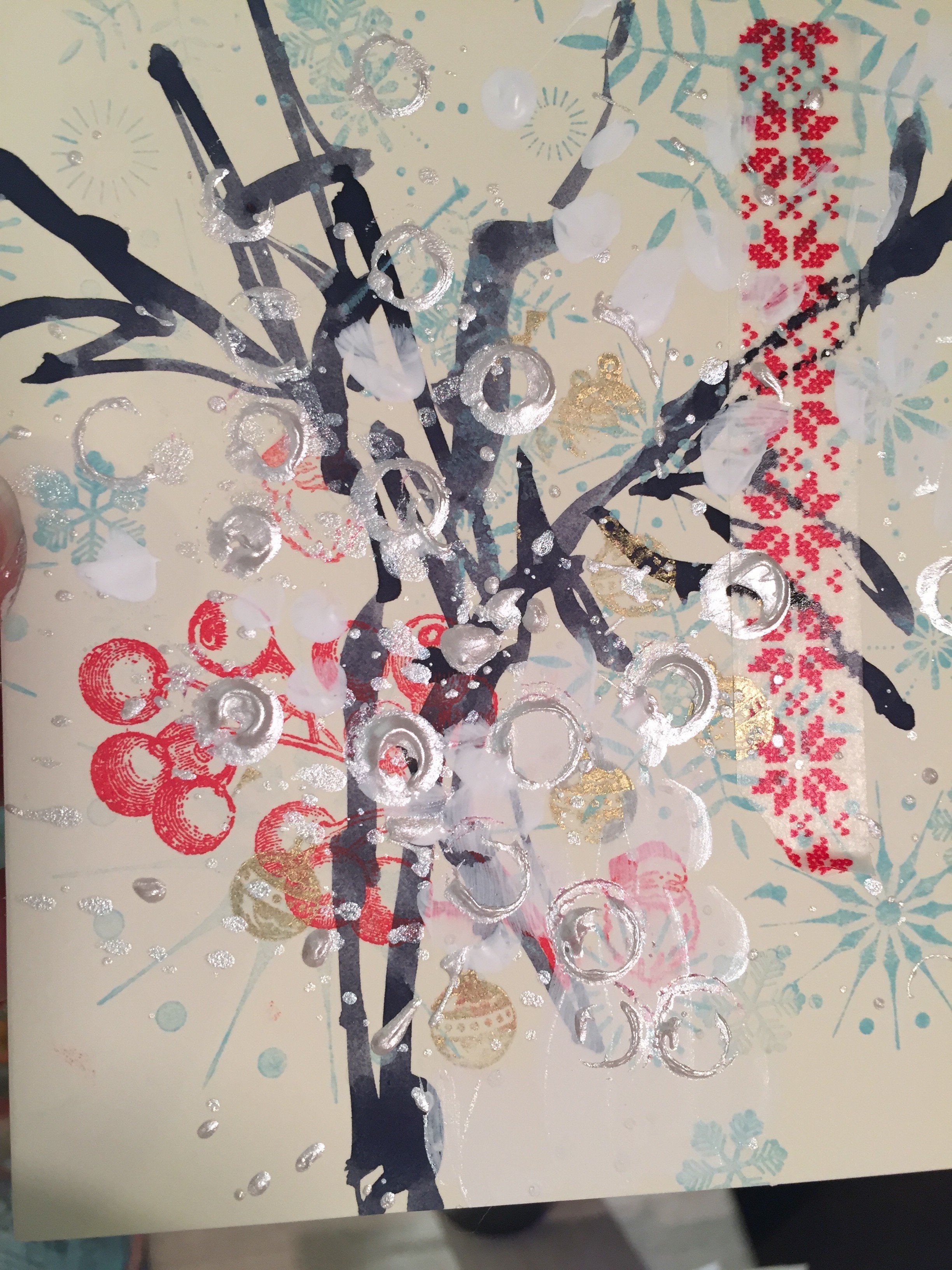
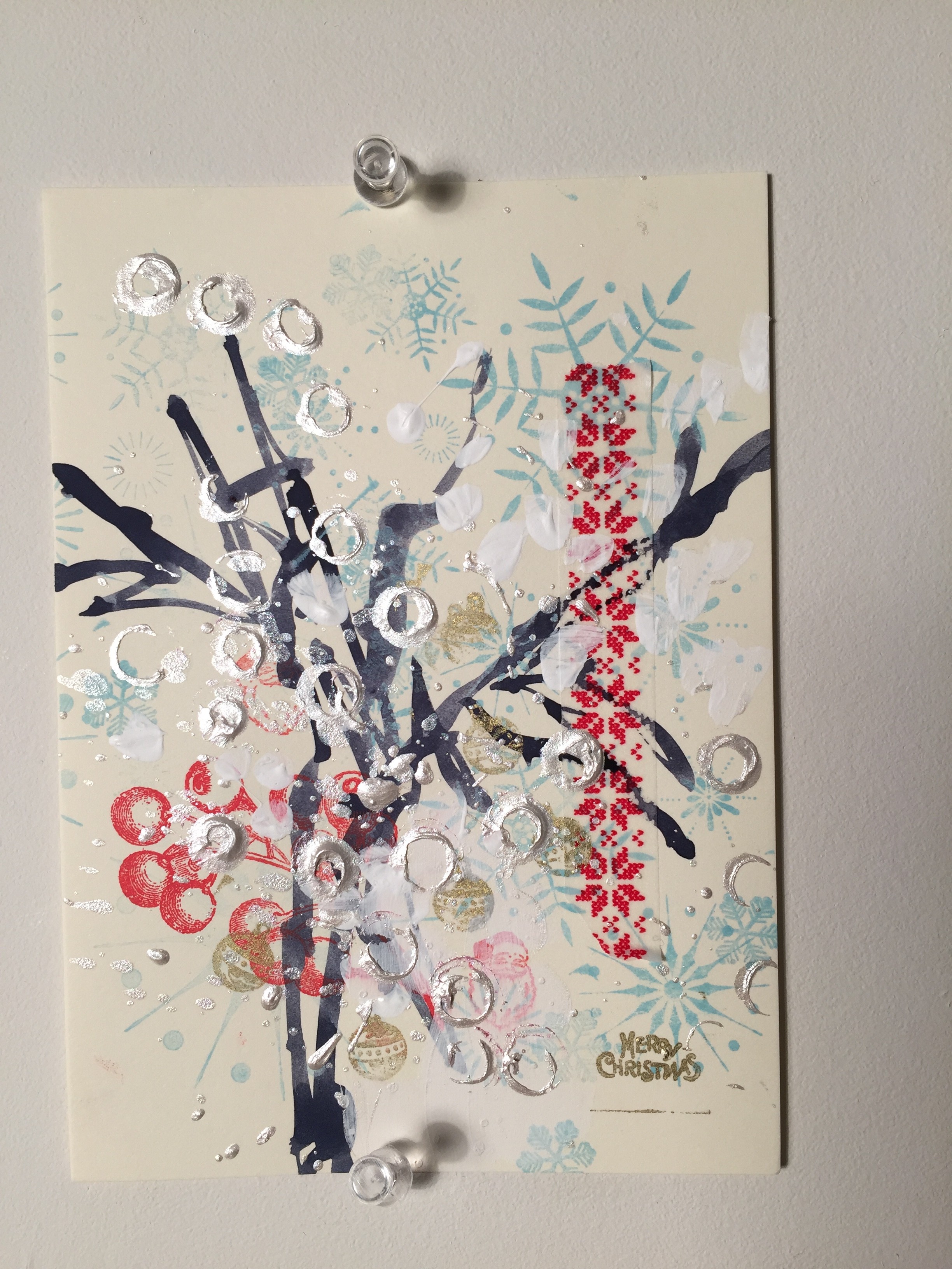
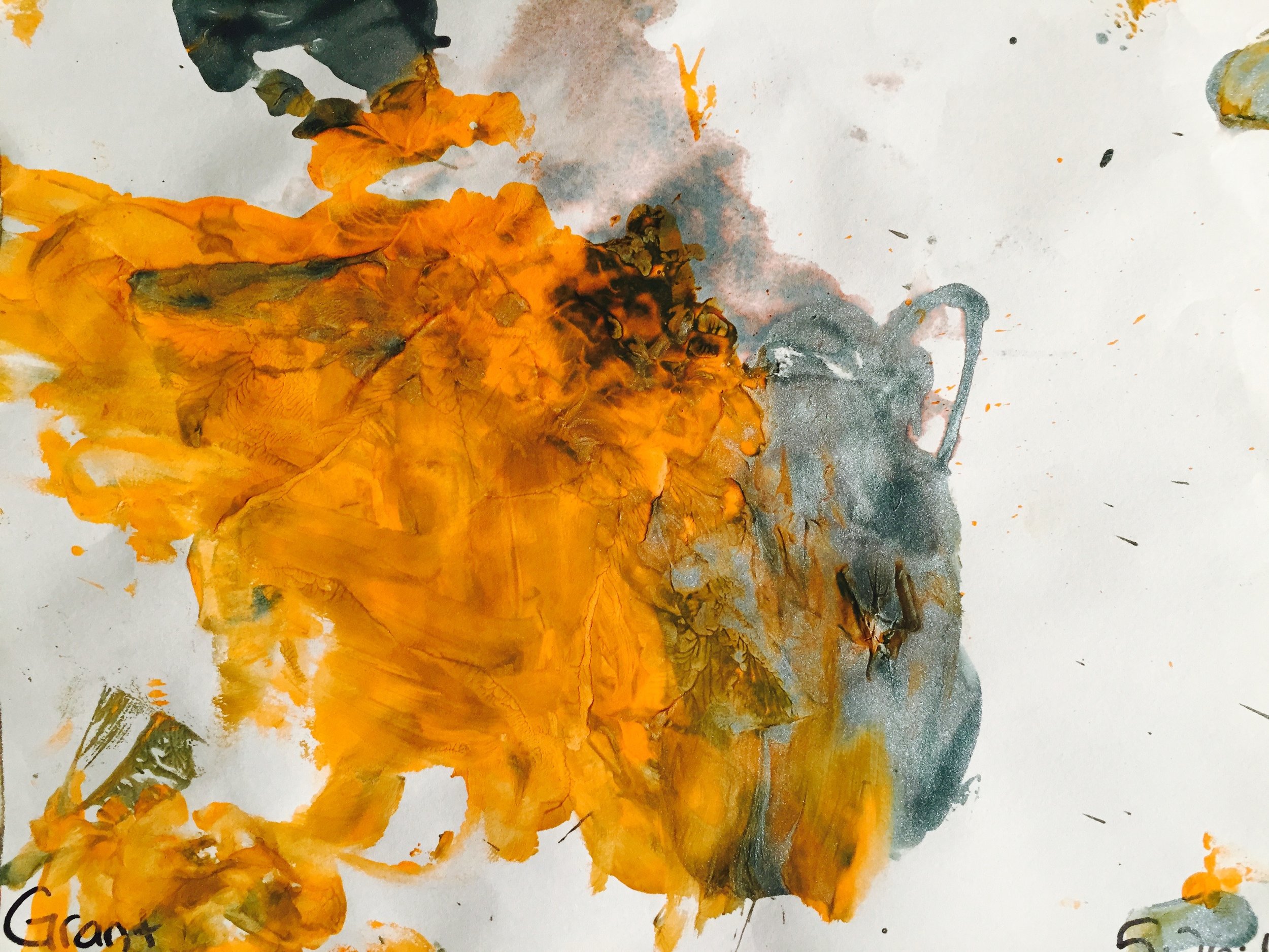
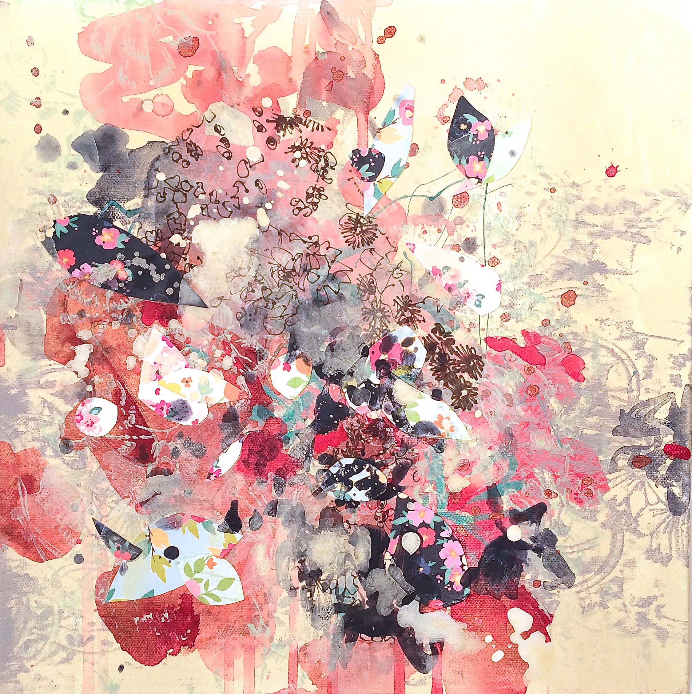
Ugly color. For this exercise, you have permission not to care about color. Color is perhaps the #1 strategy for creating "beauty" or "dissonance" and because most normal people are not aware of the simple rules of color schemes, they will dislike their painting or their room color simply because of the color, and not some of the other elements. But for this exercise, don’t care about colors schemes, mix to your heart’s content but make sure you apply plenty of paint to the canvas. Don’t worry about if the paint is transparent or opaque, acrylic, oil, watercolor, if you use pencil, pastel or graphite, or cut up paper or photos to glue. It can totally be mixed media. And it can certainly (and will inevitably) turn brown and yucky like my two-year old's paintings. Just embrace it all and imagine yourself as a two-year old yourself, simply being in the moment not caring one bit about anything else.
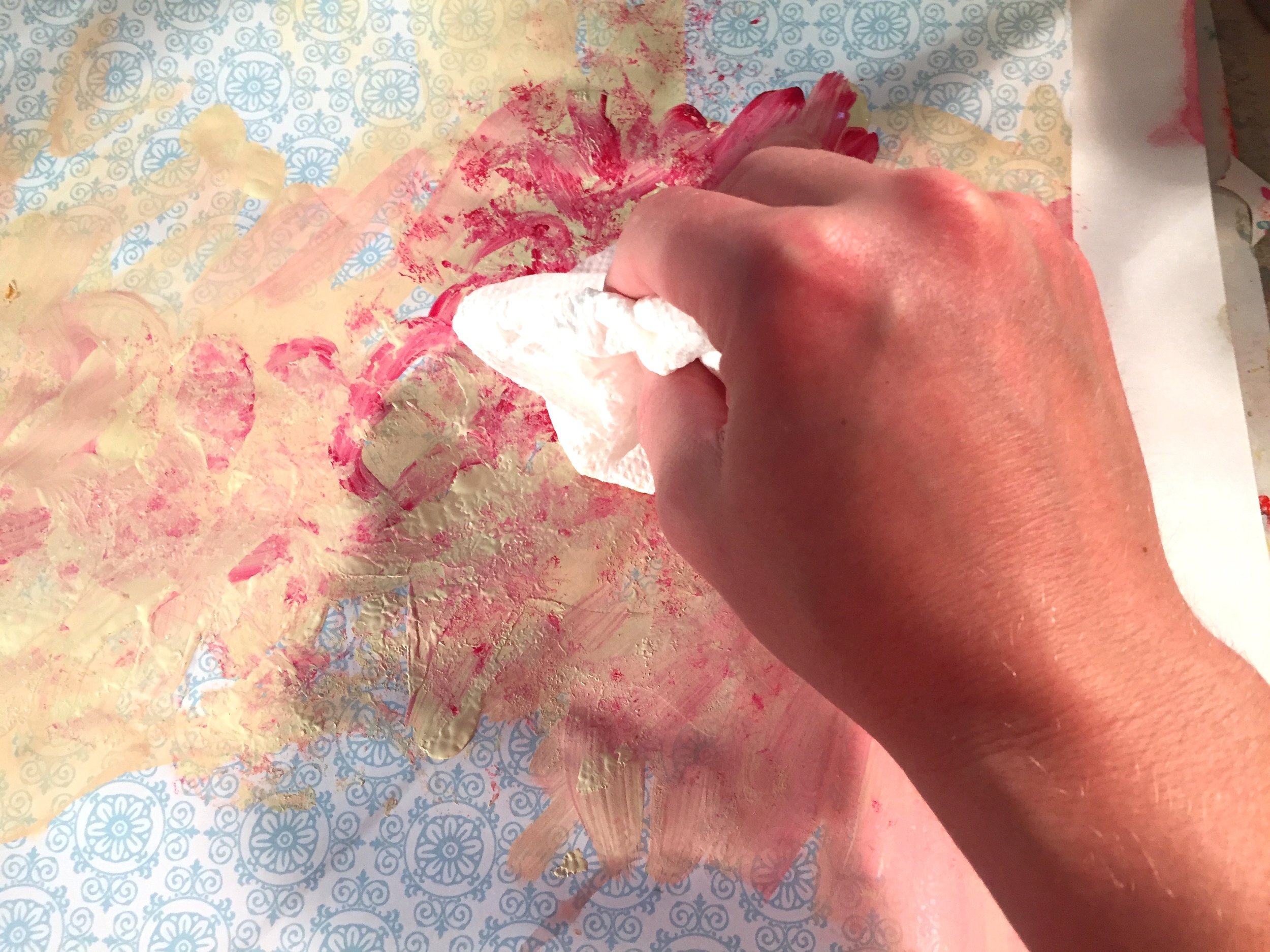
EXPERIMENT — Be PHYSICAL (whip the paint around, pool it, soak it, blot it, sponge it, throw paint at the canvas or other surfaces, scrap it, dig into it, mix it with leaves, dirt, different mediums whatever. This stage is WHO "F" CARES! There’s no one here at all to care what you are doing. Remind yourself there's "no right way" to do anything! Experiment with different brushes - huge, medium, tiny. Experiment with the bottom of the brush or sides of the can. Notice how you hold brushes or knives in your hand. Try your less dominant hand. Try flipping brushes around, holding close to the end, or in the middle. Throw paint from your brush. Use knives to scrap and smear. Use anything to “stamp” different patterns like bottoms of cans or bottles, etc. Try stencils, cut up wrapping paper, paint on tissue paper, primed and un-primed canvas or linen. There’s 100’s of ideas, just start DOING.
Move it - physically move it from the wall to the floor while adding layers. Rotate it 90 degree. Paint a layer. Rotate 90 degrees again and then paint a layer.
No Rules. There are no rules!! — try to keep turning off your brain if it says “This isn’t right! This looks horrible! Am I doing this right? Ick! I don’t like that ...” Try to act on your impulses and trust this is just practice.
Timed sessions. If you're stuck, then time yourself for 5, 10, 15 or even 30 min force yourself to stop. Wait for layers to dry. Then time yourself another 15-20 minutes, stop, wait for layers to dry. Do this 5x (30 minutes each). Take pictures within each stage. Notice how much change the painting goes through in each of those layers.
Finally, end it — don’t fool yourself that this is a “masterpiece!” No one needs to see this, ever. No one even knows your doing it if you don’t tell them. When it all dries you can paint over the entire thing and start over.
But you have to END the piece, so I recommend the exercise of ending after 5 layers. If you feel like you need more than of course by all means keep going! But at some point stop and start another piece.

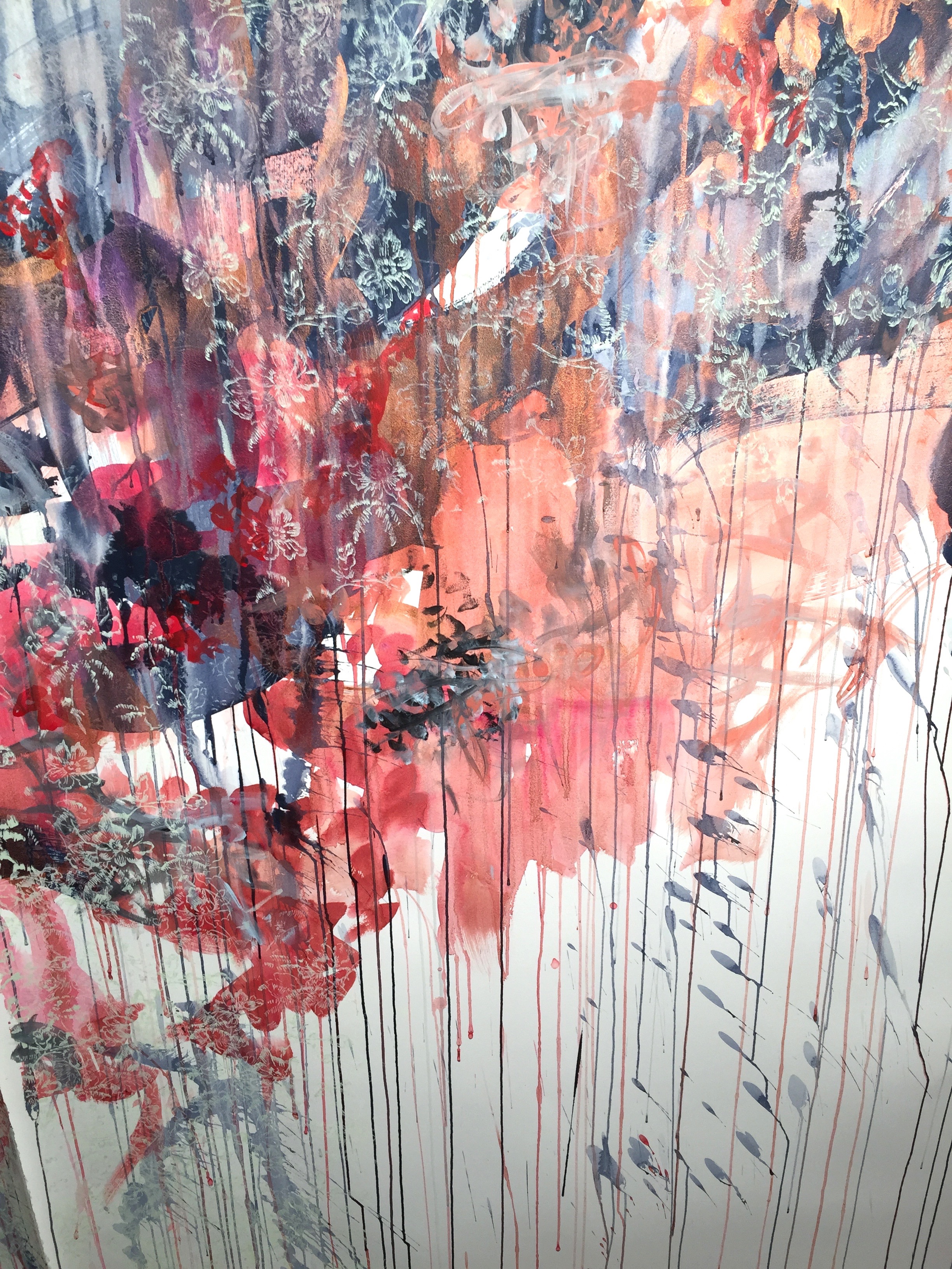
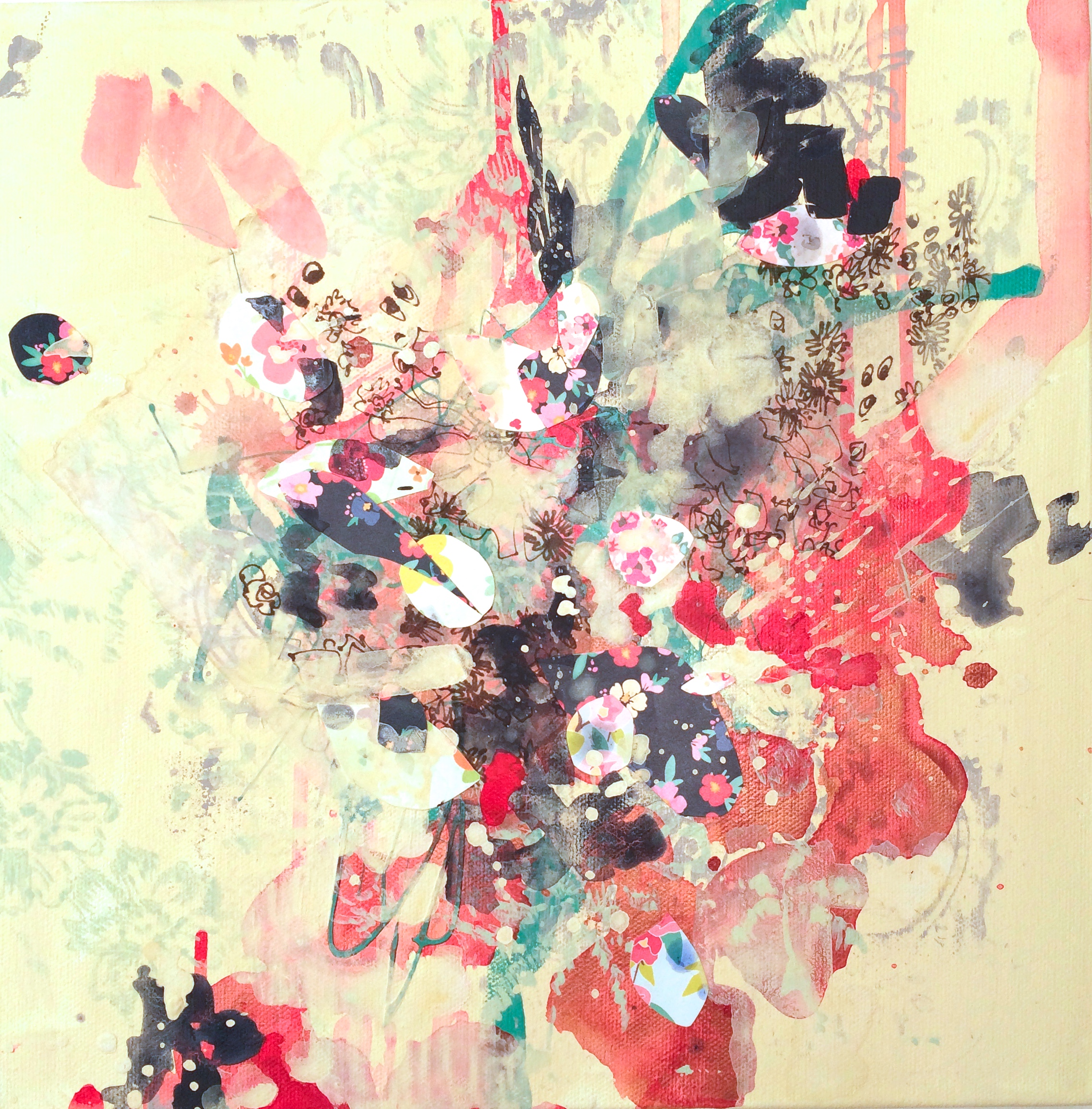
In process painting, circa Sept 2007. © 2007-2018 Kathryn Neale Studio
Congratulate yourself! Step back and notice if new effects or unexpected “mistakes” that you didn’t intend happen, and that you really like. Get past the awful color combos and weird looking shapes. It doesn’t matter right now! But that “stuff” that was accidental means in that moment, you let go of your brain and acted intuitively.
That is what we want more of, and that is the essence of this "freestyle" abstract painting.
Hopefully this one exercise lets you give yourself permission to play and not care at all what the end results looks like. This gives you permission to be in the process of painting itself instead of worrying if it's "right," or "beautiful" or following any expectations that you didn't even know you might have had on yourself.
Some people might totally embrace this style of free-flowing expression, and feel it's very natural to tune into one's own intuition to make decisions in the moment. For others, this might totally freak them out.
That's totally OK. I hope you felt and saw glimpses of yourself letting go, being in the moment and being open to not knowing what the end result will look like. Also, learning to be aware of the feeling of being uncomfortable with the process. It’s OK. You will get better at it I promise. It's called "practicing" for a reason. You are not required to create a masterpiece.
And finally, I hope you enjoyed the unexpected thrill when something you didn’t plan happened, and it ended up being an interesting effect, color combo or cool texture. Those are the highlights of the exercise to take with you as you start your next painting and then... your next!

In process painting, circa Sept 2007. © 2007-2018 Kathryn Neale Studio
If you would like more resources, here is a simple audio of a guided meditation to help you to think like a kid again and enjoy the process of painting!
And here are links to my 100 Day projects where each exercise I'm visually experimenting, practicing and trying to follow my intuitive, creative inner guide. Some work and some very much don't. But I have uploaded all of it to show the process.