
Christmas Cards 2015 from Kathryn Neale on Vimeo.
Christmas has come and gone! Wow! What a rush!
I did manage to sneak some time in (not sure how) to make about 36 Christmas cards to send to my friends and family this year. Hence the video above I actually figured out a way to tape myself with my iPhone! And it all didn't turn out to be a disaster which can definitely happen quickly if you don't really plan. Found myself thinking about making these things, ordered the stamps and the wasabi tape and when they came it was that moment of . . . "am I really going to do this?" I'm so glad I did! It was so much fun. And it was a joy to have some kind of excuse to do a little painting - which I haven't done in a few months (I always go in and out of bursts of painting energy).
So I thought I would share my thoughts on the project and how you can make your own Christmas cards - OR any kind of small series of works. I realize that there is a sort of method to the madness - especially when you're working very fast, and very small and using similar media elements and layers, I realize there are some "rules" to apply to that make it look like a cohesive series but not all look exactly the same. Each Christmas card is unique. But they all have similar elements or layers that I used and by the end I got really good at varying the beginning of each set of layers but always stuck to the last 2-3 layers by choice. And there are reasons behind all of that.
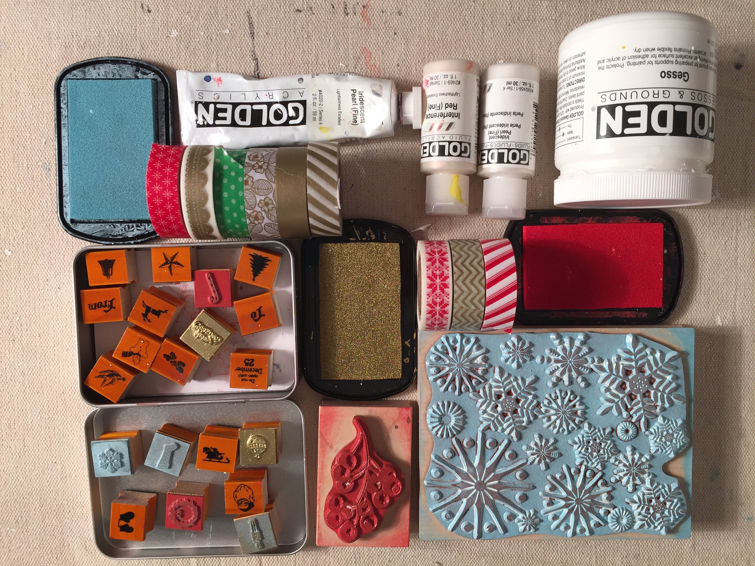 So first, let me introduce my supplies and materials.
1. Choose things that inspire and in this case, are quick and easy for you to apply. For example, for some reason lately I really like Christmas stamps! I'm starting to collect several kinds over the years - 1 is the large design of snowflakes that are just quite beautiful but also very versatile. You can always incorporate snowflakes!
2. In this case, having fun but being QUICK is also a factor. I didn't want to "labor" over these things so I needed to make more of a collage then an actually all out painting. For heavens' sake just making about 34 was enough! :) So choosing this super cute set of Christmas stamps (very small because my cards are small) was also a plus. I didn't have to use all of them - actually I only ended up using about 6 different ones, but it still created a cohesive look using 2 or 3 for each card. One of them (the ornament) I ended up using in all of them as a main layer because I liked the look of them "hanging" from my tree. But more on that later down in the explanation of each layer.
3. Color. Color is very important. Try to use a color palette of 2 or 4 colors. More than that really does make it over the top for the viewer. I limited my color palette with my stamp ink - light blue, red and gold.
4. And wasabi tape also introduces "POP" of color and maybe even more important, PATTERN to infuse a little Christmas atmosphere and also a graphic element. Wasabi tape is used mostly as an "accent" to the piece.
5. An off-white 4x6 card from Paper Source provided the perfect back-drop. I wanted off-white because I subtly wanted the "white" from the gesso and paint to show and not completely blend into the background.
6. Finally, gesso paint that's bright white, and fluid iridescent white pearl paint (in liquid acrylic and solid acrylic) so that I could add a little texture of abstract "snowy" elements. This is a perfect opportunity to use an iridescent paint that almost "glitters" in a way because it even more reflects the light like so many decorations this time of year.
I must add that these choices were completely intuitive. As I write them I am analyzing them with my "left brain" and each one makes sense why I would use these materials. The gold ink palelette was brand new choice for me, I usually don't like gold or am attractive to that color but it worked quite well with the other bright elements of the card.
TIP: Use again what inspires you. It could be Christmas tags, stickers, old wrapping paper elements that you can cut up and use. Parts of magazines or old books that have been torn away. Anything that is graphic--inspired, patterned or particular nostalgic is perfect for Christmas card themes. But again, try to keep it to 1-2 graphic element, 1-3 painterly media, perhaps 2-3 stamps or 2-3 drawing media. The variety comes in putting it all together because each card will end up being different and unique.
****************************************
THE PROCESS:
Tip #1 - Try to use about 8-10 layers at most with such a little space as this. They need to be a variety of materials/media and color. Use what INSPIRES you to HAVE FUN!d o
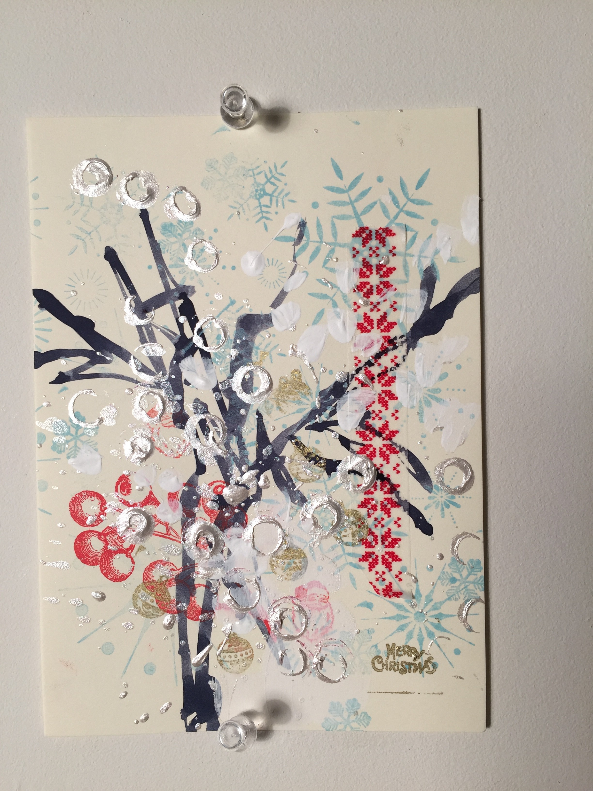
BREAKDOWN OF MY LAYERS:
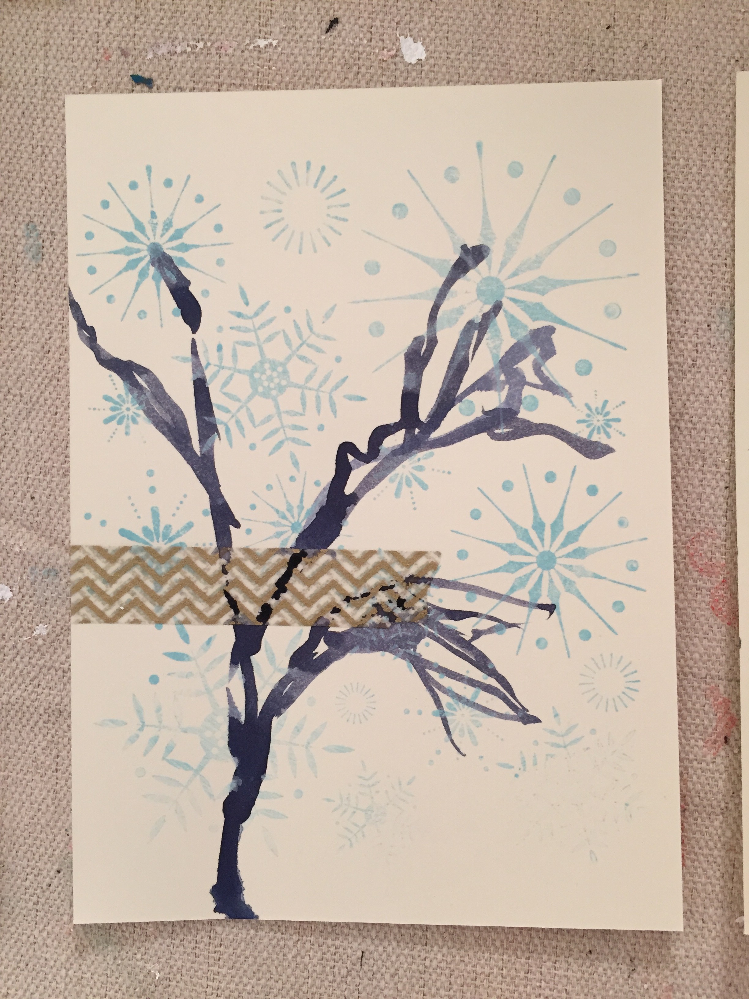
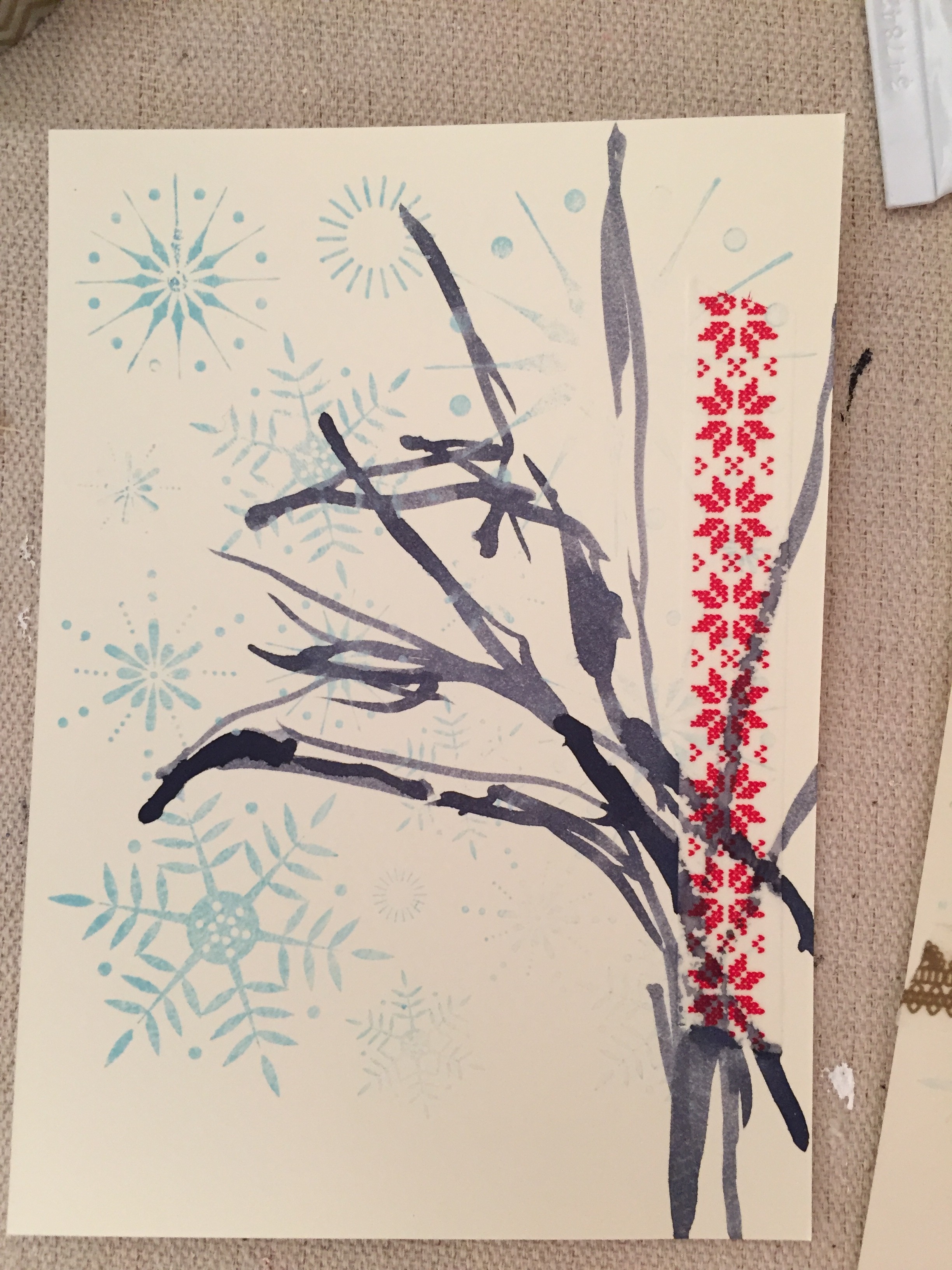
- Light-Blue snowflakes
- Wasabi Tape
- Silhouette of abstracted tree (line quality)
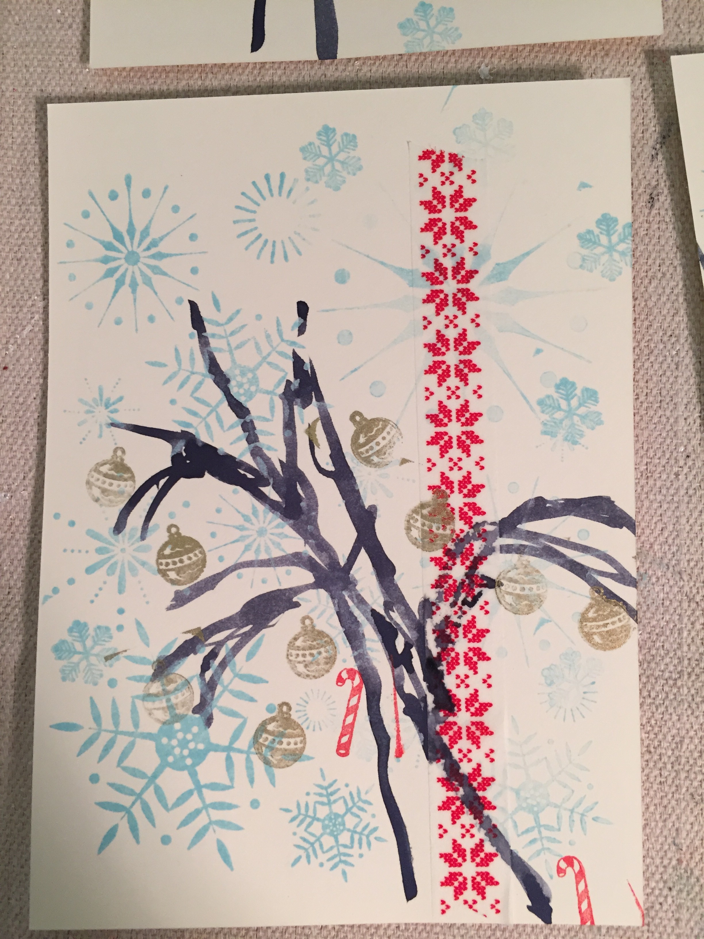
4. Red stamps of either candy-cane, santa face, wreath, basic image of christmas 5. Gold ornament stamp

6. Red berry stamp

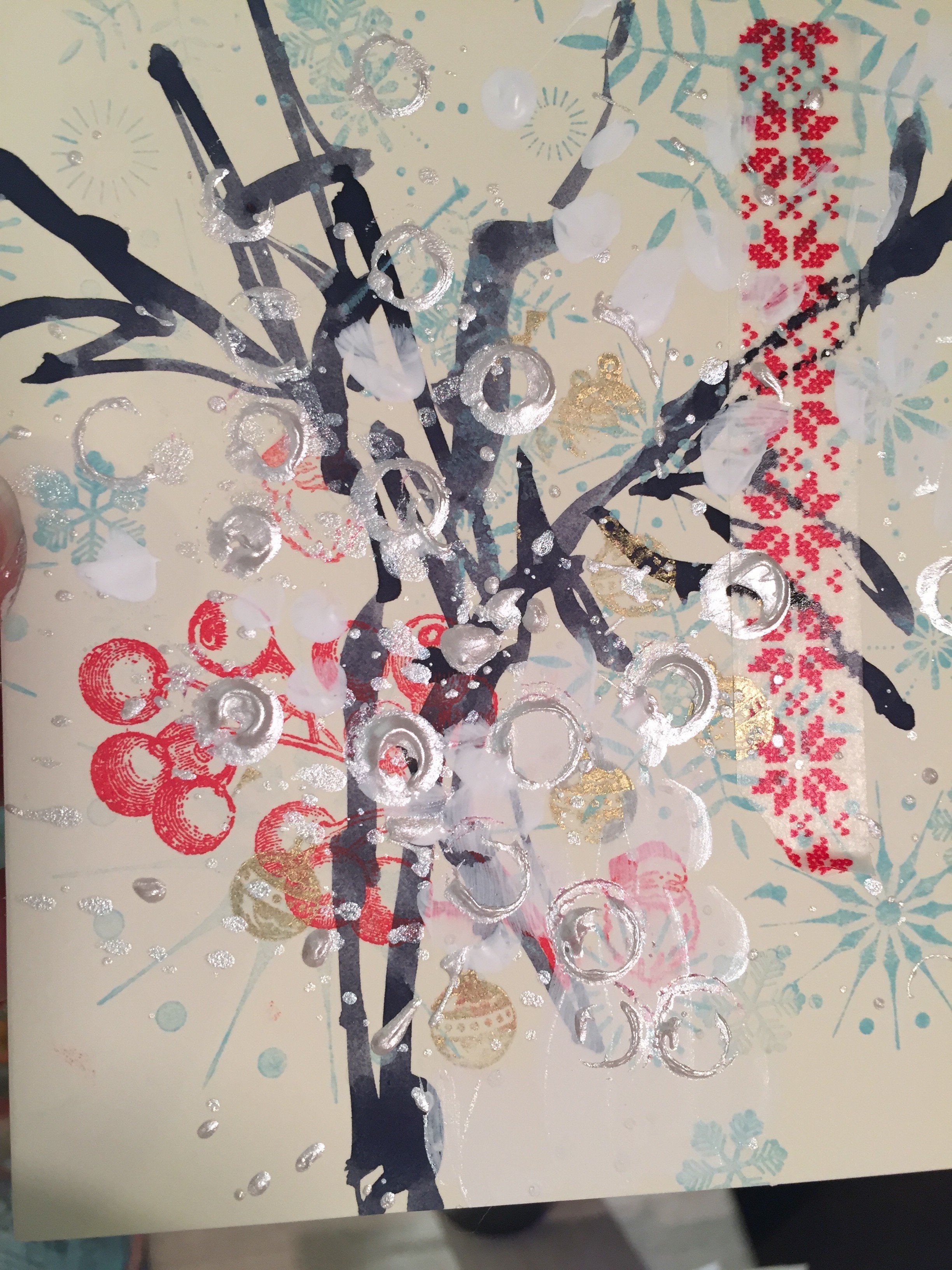
7. White gesso 8. Iridescent white liquid acrylic 9. Iridescent white solid acrylic
** Of course while I was taking these pictures I suddenly blanked and forgot the red berry (GASP!) that I usually put in about the middle before some of the stamps and definitely before the white paint at the end. that's OK though! See example below though where the "red berry" stamp is DEFINITELY ON TOP of the white paint layers but that's totally ok. It's just a slightly different effect then the one below it where it's "behind."
****************************************
MY PROCESS:
- Snowflake layering - notice that I vary how I put the stamp on the page, sometimes lining up with the entire stamp to cover most of the page, sometimes not. Notice that not all the "snowflakes" come out perfectly. But that's what I love - VARIATION.
- Wasabi tape - that's one of the most fun parts of these cards I think because it really brings a lot of the piece. Some of the tape is bright red, some designs, sometimes gold pattern, other times even green (although I limited the green because that can get obnoxious if used too much with this palette because I wanted to keep things pretty limited). Sometimes I used smaller "accent" pieces and sometimes used a couple different patterns/colors. Other times I ended up using a larger "strip" of tape used as a major focal point. That tape can contribute to the "tree silhouette" coming later or also counterbalance it. But it was fun to use the tape because it's very graphic and very strong piece of design.
- Tree silhouette - This is part of the piece that really anchors each one, otherwise the pieces of tape and the little "stamps" of Christmas designs would just be out there floating. The tree also lends itself to a very organic element of design, we can all identify quickly with what I'm trying to depict without getting too specific. It also is fun because it adds a "hand-element" or painterly aspect which I very much like.
- Red Berry - is definitely an accent graphic. I love the graphic because it's detailed and nostalgic. But I really like how I could use it to blend into the tree or rotate it around - mostly at a diagonal if you notice. It gives a lot of movement and again an accent without being too "loud" and in your face.
- More little stamps were fun to interchange in between all the layers and it depended on which stamps because like the Santa Face, that's very identifiable. So I didn't want to overuse it (I'm still at heart an abstract painter!). But those are fun little accent and "surprises" for the viewer and also keep in mind the over all "shape" of the stamp. A "candy-cane" is different then the wreath which is a circle, etc.
- The ornament stamp was fun because it brought the gold ink into the piece rather nicely. It plays a supportive role but enhances the idea that the tree has ornaments without being too literal. But the gold really helps keep a "neutral" in the midst of all that bright color etc and then also can unify the piece, and play another supportive role if the wasabi tape is gold too.
- White gesso - Used this in "blobs" to kind of mimic snow. I didn't want to overdue it thought because gesso is opaque and it would just block out whatever is beneath it. But because it's pure white, it was fun to use as a starting point for now.
- Iridescent white liquid acrylic paint is fun for "blotting" or "flicking" the paint brush to make much smaller droplets of paint and since it's iridescent it reflects the light.
- Iridescent white solid acrylic paint was my second favorite layer because I accidentally just started playing with "stamping" the tube of paint, using it totally as a stamp and out came these cool circles/semi-circles and created a really fun overall texture to each piece.
****************************************
Tip #2 - HAVE FUN, HAVE FUN, HAVE FUN! Don't get too worked up about when you put this or where or if you (heaven forbid!) missed a step etc. You might want to practice 1-4 cards at the beginning to experiment freely and get your rhythm what you are going to do. At the end, "stamping" a tube of the iridescent white solid acrylic paint worked so well for about 25 of the cards and then that last 9 or so, the paint start to wear out and the "bubble" that inevitably had made this cool "circle stamp" that was totally organic and free suddenly started plopping out GOBS of paint. You just worked with it. I dabbled some of it back up with a paper towel and other times just using a brush to "paint" back in some marks that didn't have anything to do with anything. But it was fine. Not what I wanted intentionally because the first time I picked up the tube of paint I excitedly stumbled on this cool texture by accident. But also, this kind of accident not totally worth welcoming but you have to sometimes make work what are "real" accidents and not just happy ones that you delight in. It's all part of the process and it's all part of "LETTING GO."

****************************************
See the final 36 pieces here in the gallery.