It would take 5 more years until I decided within my own heart to try to “be an artist.” Lots of experimentation along the way and trying to make it in the “real world.”
Something “clicked” my senior year in my college art program after my France Abroad (see “Part 1”). However, even though I had an entire spring semester to “explore” my new painting style, I got very, very frustrated. Because, even though my professor recognized something in me to keep going in that direction, he could not take me there. He could only point the way. So I spend those final months asking myself what the heck did I do to get my church painting & how do I do that again?
We all then started life after college graduation. I married (too young in our opinion) my high-school sweetheart and we moved to downtown Chicago to “start our life together.” It was tough. I found a job at a then-start-up commercial real estate firm who needed a graphic designer to put together their building flyers. My new bosses were hard-core born & raised Jewish New York City entrepreneurs that set off to conquer the real estate market in the “backwaters” of “puny” Chicago. Those 3 years were life transforming for me, & under their co-Founder, Jeff as my mentor, I learned a LOT about helping him start the Marketing department & business, as the firm rapidly grew from 3 brokers to over 20 when I left. It was such a cool experience.
But, I was creative and a dreamer. I wanted to travel, see the world and figure out my life on the fly. I married someone very opposite of me and even though we both thought we knew each other since we grew up together, very soon it was VERY evident that once we started making hard life decisions, we were VERY, VERY different. Looking back, we both never got some time spent by ourselves to figure out who we wanted to be.
I got pretty depressed. I felt this huge “drive” within me to “do something creative” but I didn’t know what. For so many years, I just felt I had a big question mark about it. I still at this time, felt very insecure about becoming a “real artist.” So I did everything I could think of to foster my dreaming around my strict 9-5 job.
I thought maybe I’d go back to school to be an Art Historian, but I needed to be fluent in at least 1 European language, preferably 2. I also needed lots of credits/portfolio showcasing my research papers (which I had none). I looked into MA in Graphic Design but since I was a minor in college, I did not have enough credits to get into a MA program without showing I finished other foundational coursework. At that point, web design and Flash was all the rage and I am not a software programmer so it was pretty intimidating & there was not a whole lot of space for creative folks like me to fit into such a technical world. There was quite a split still, either print-focused or web-focused. I looked into being an Art Teacher but again, needed Education background to fulfill that role.
But all these weren’t enough and I truly felt I was missing out on the opportunity that I needed to take before I had kids. I instinctively knew that once we wanted a family, I would be the type of mother that would be 100% devoted to that role, and if I did anything “selfish” for myself, I would need to do it BEFORE kids.
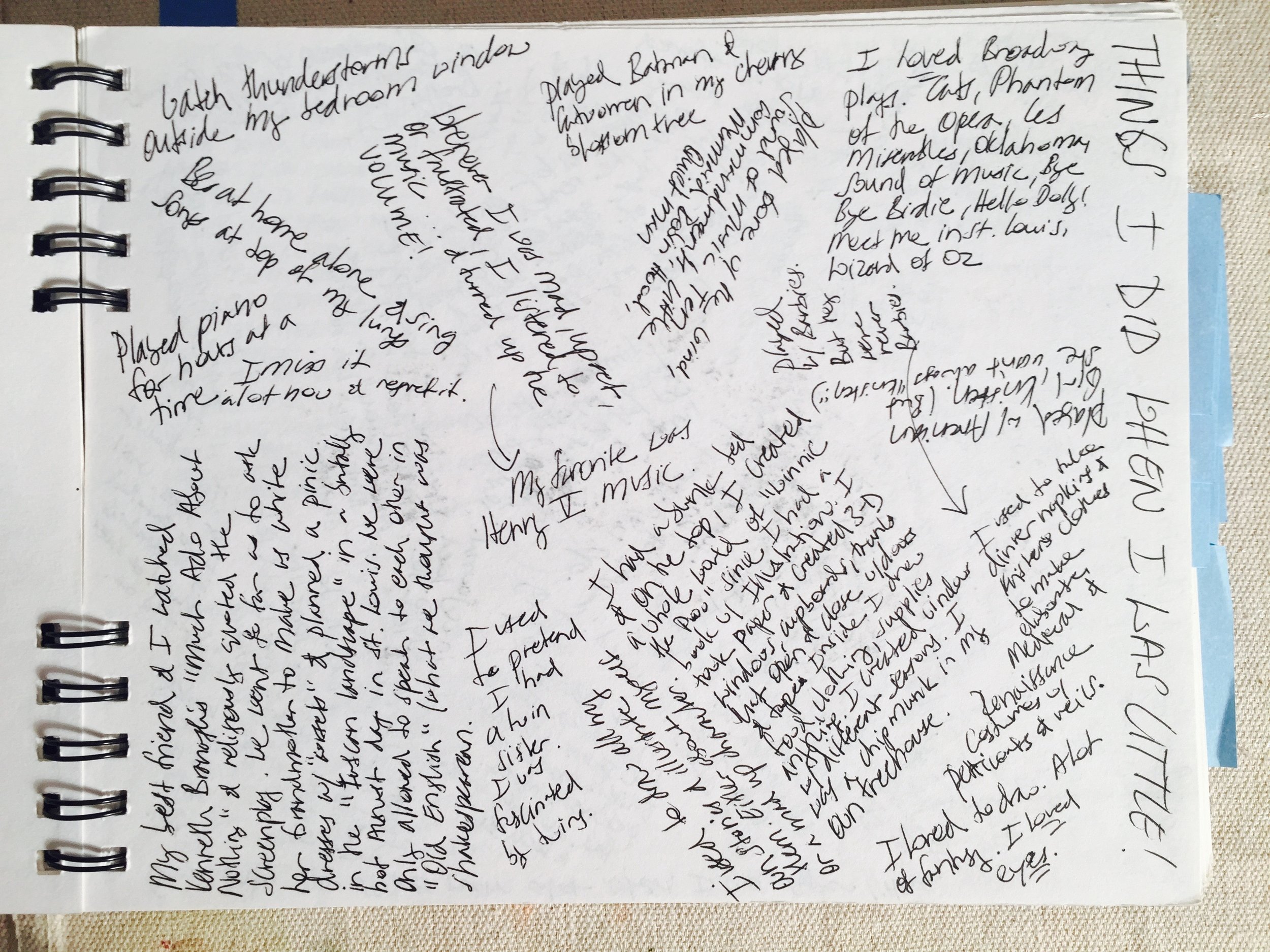
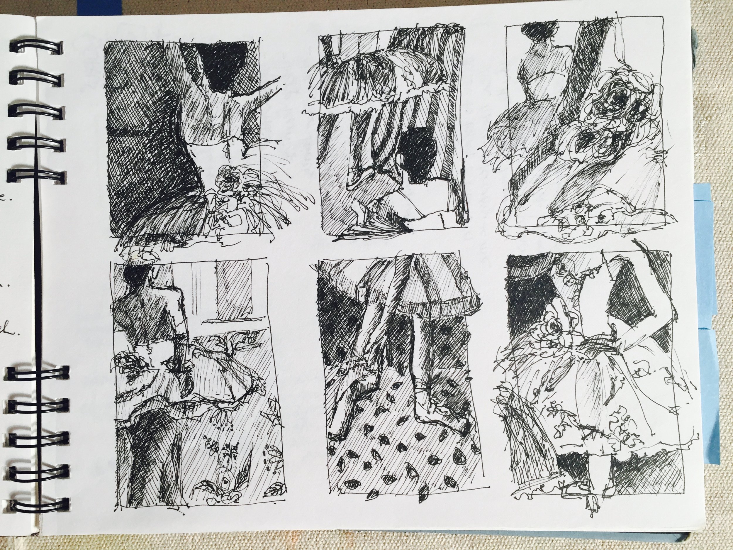
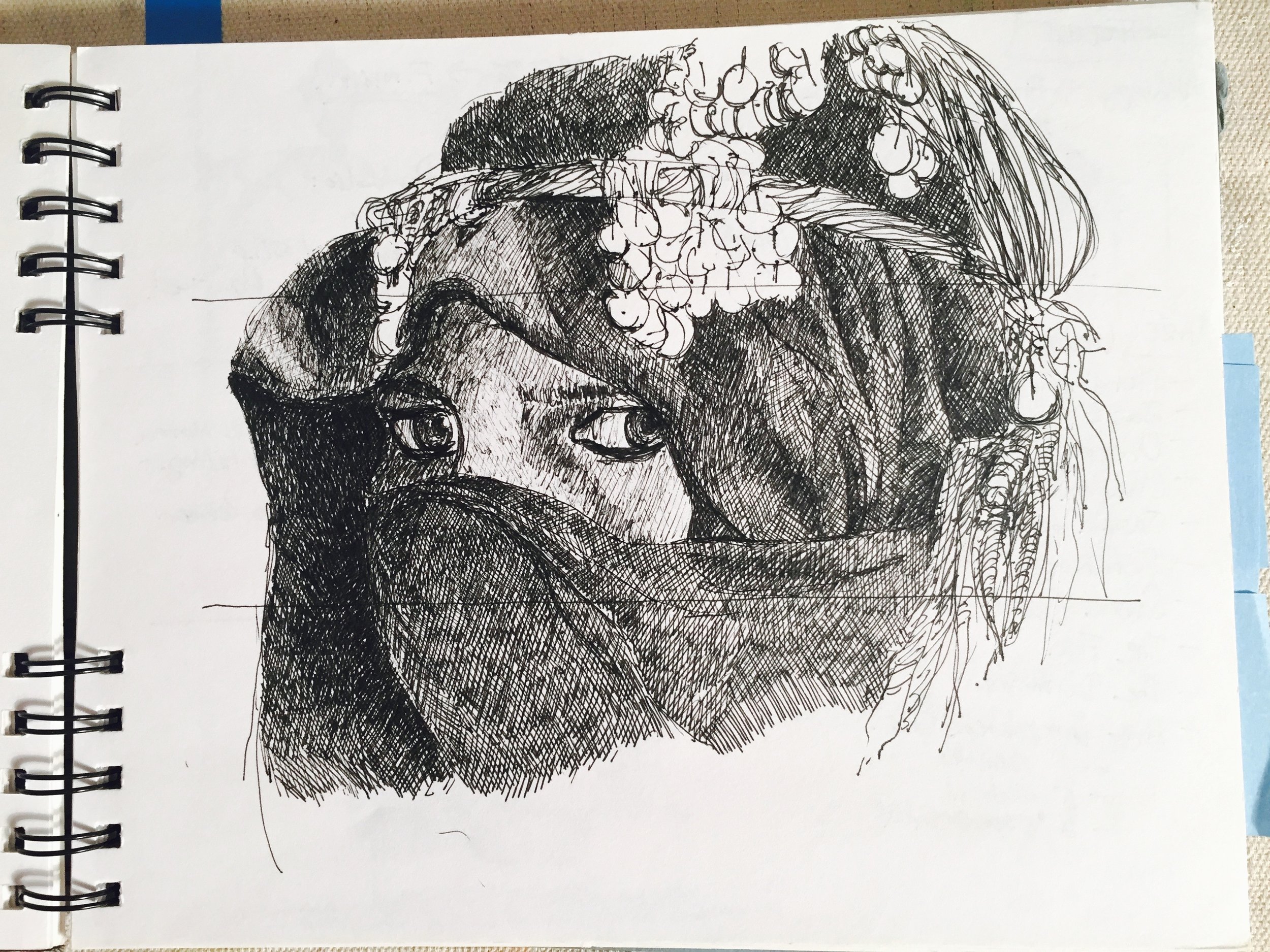
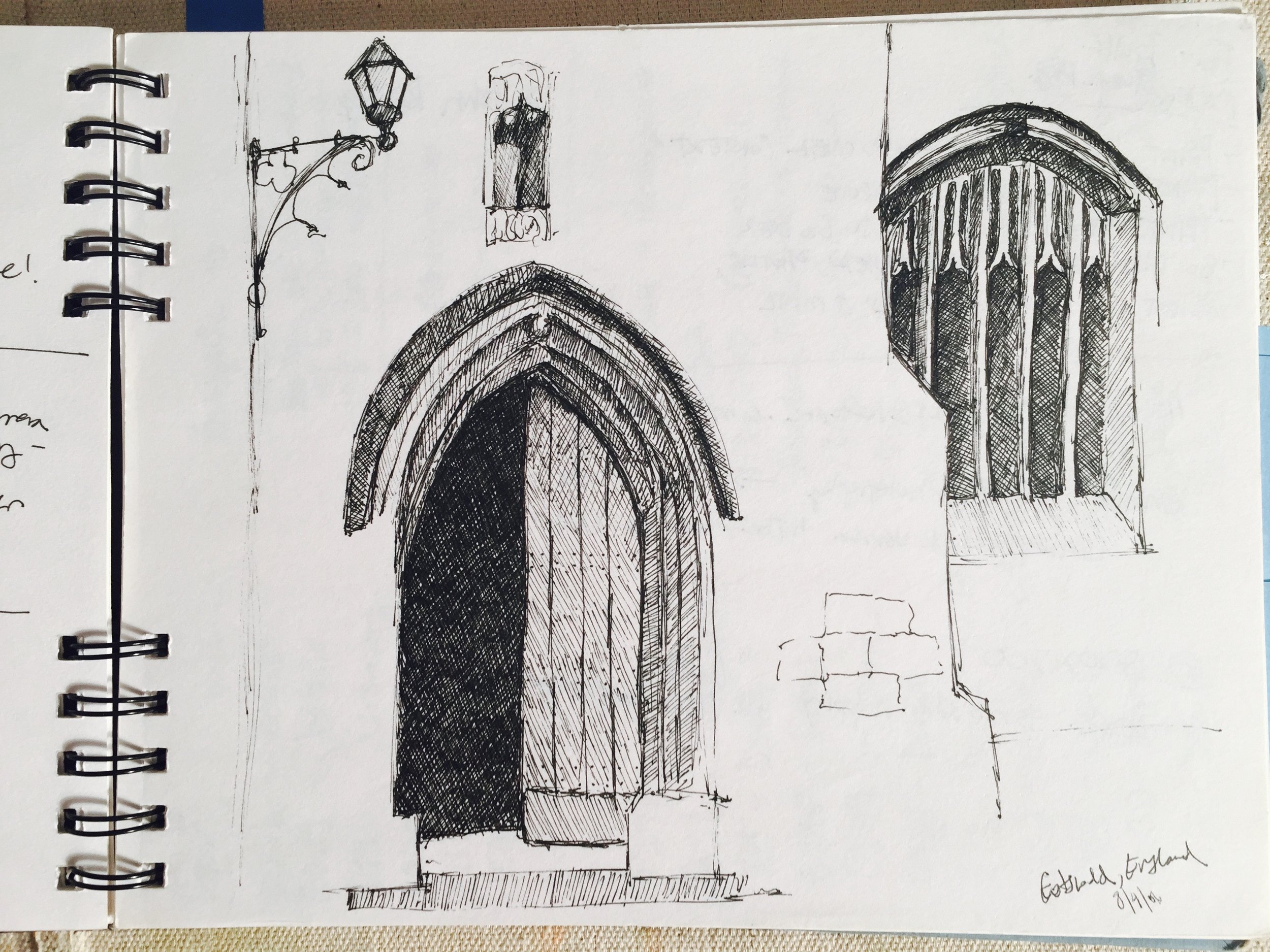
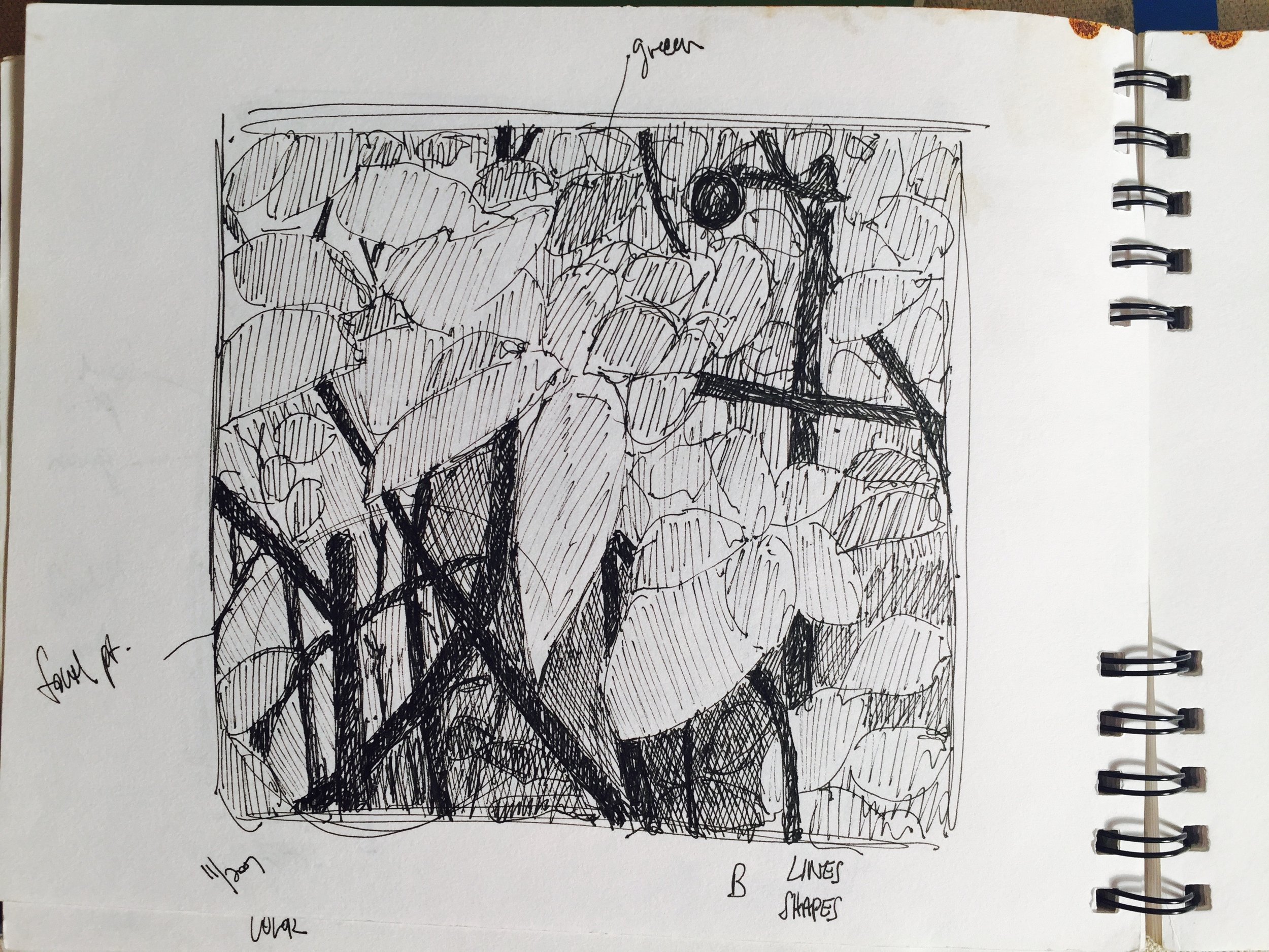
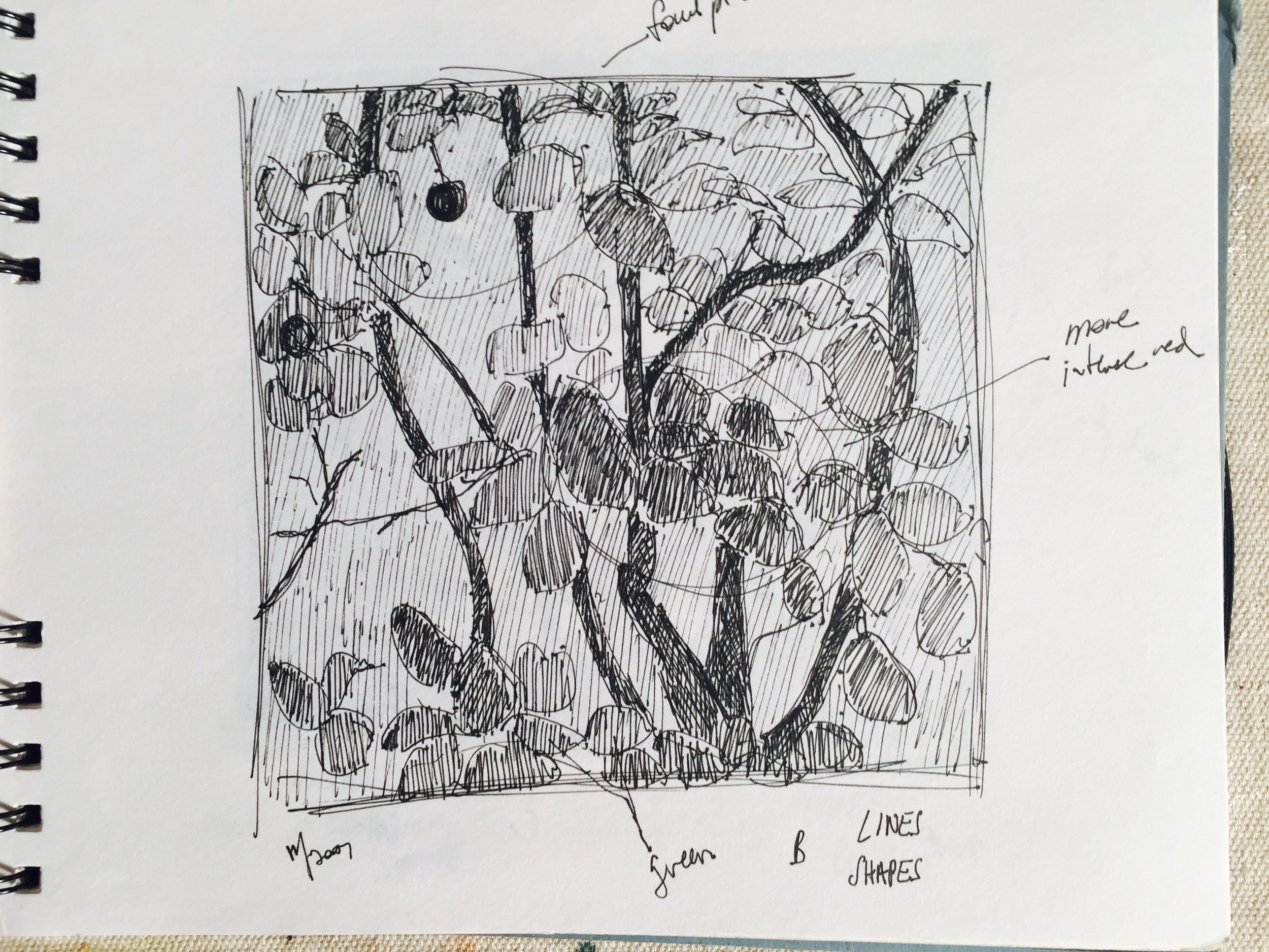
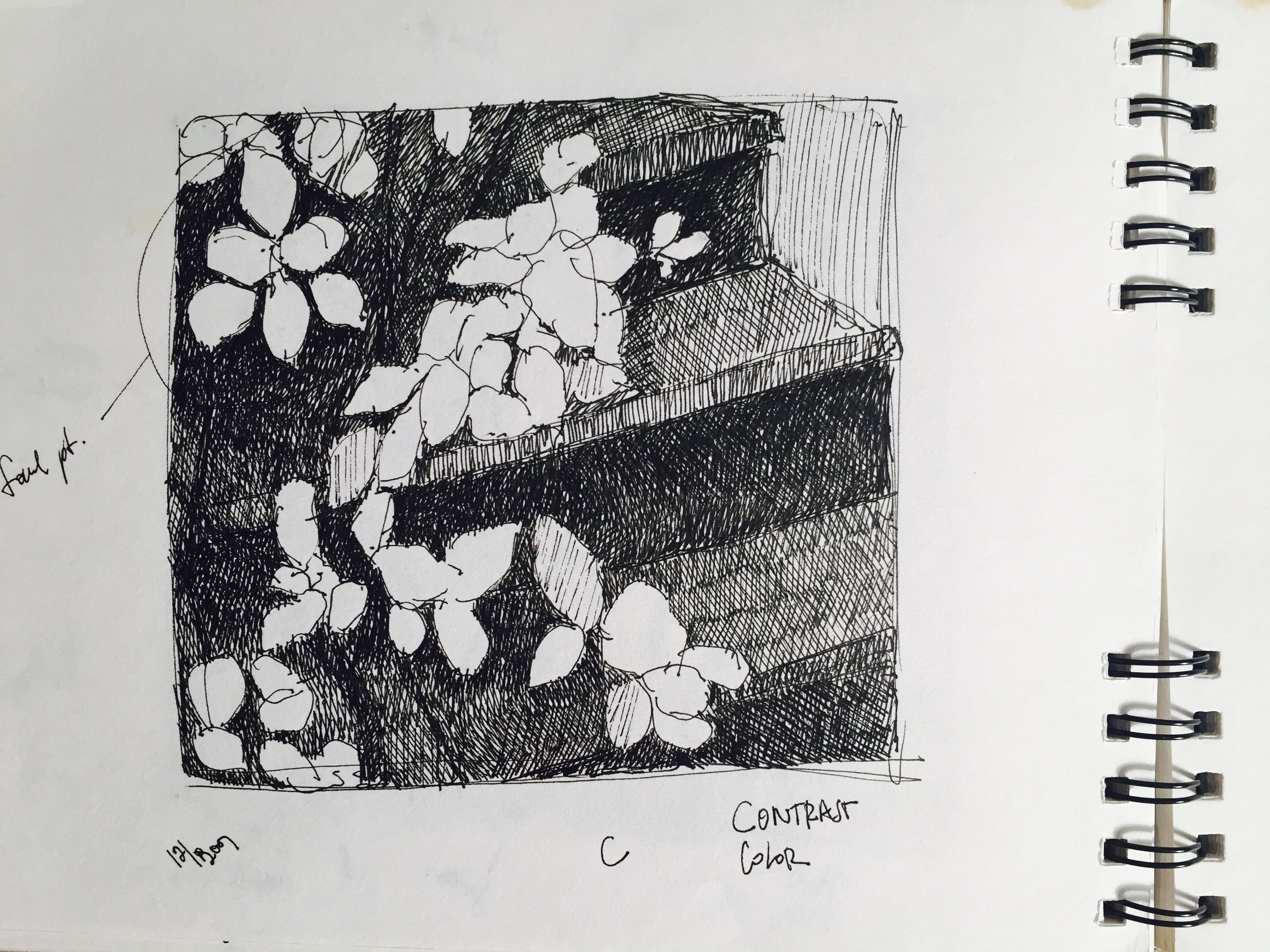
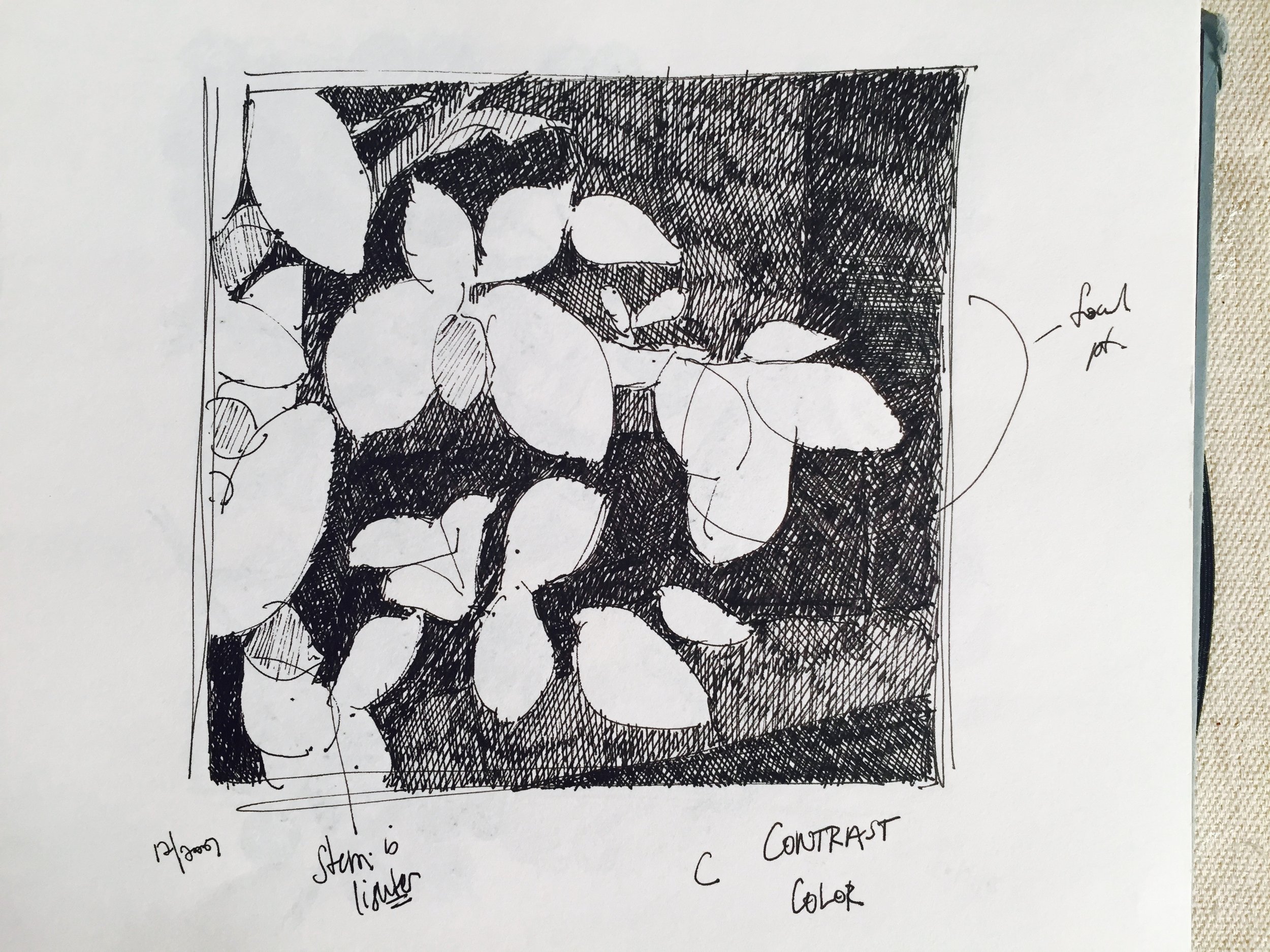
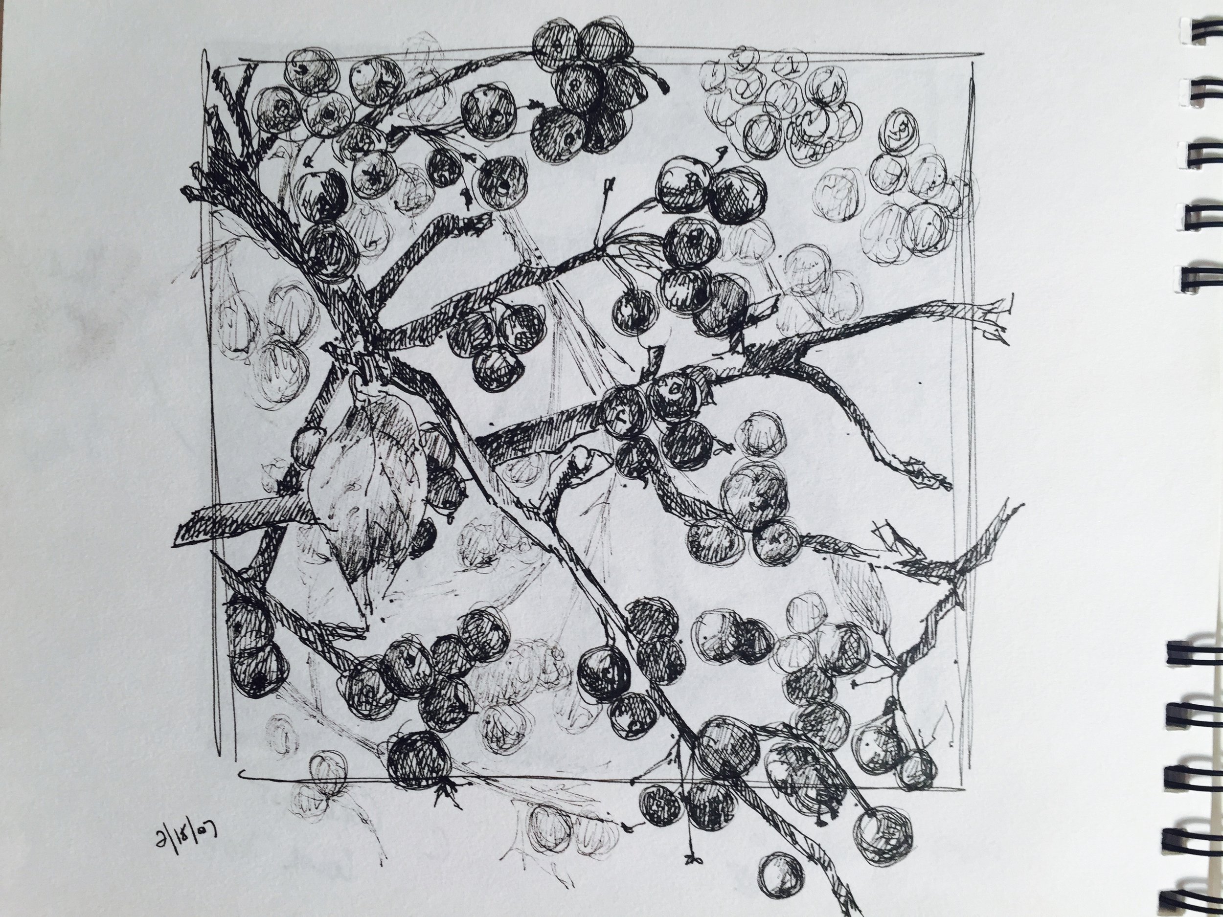
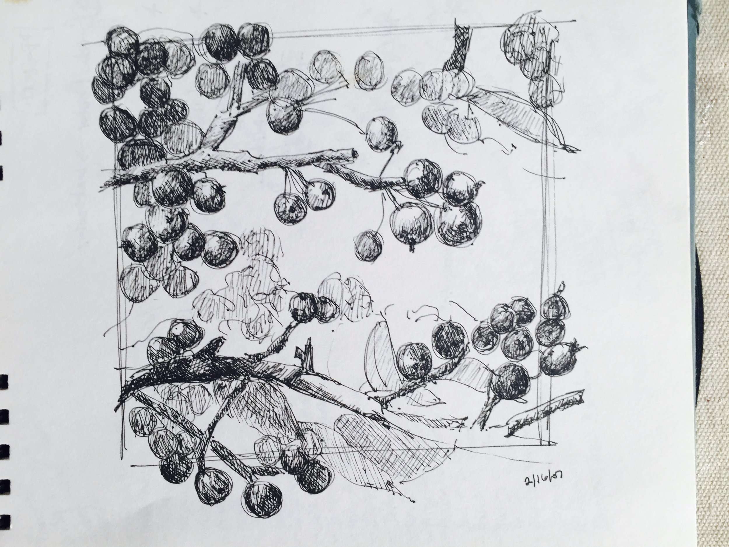
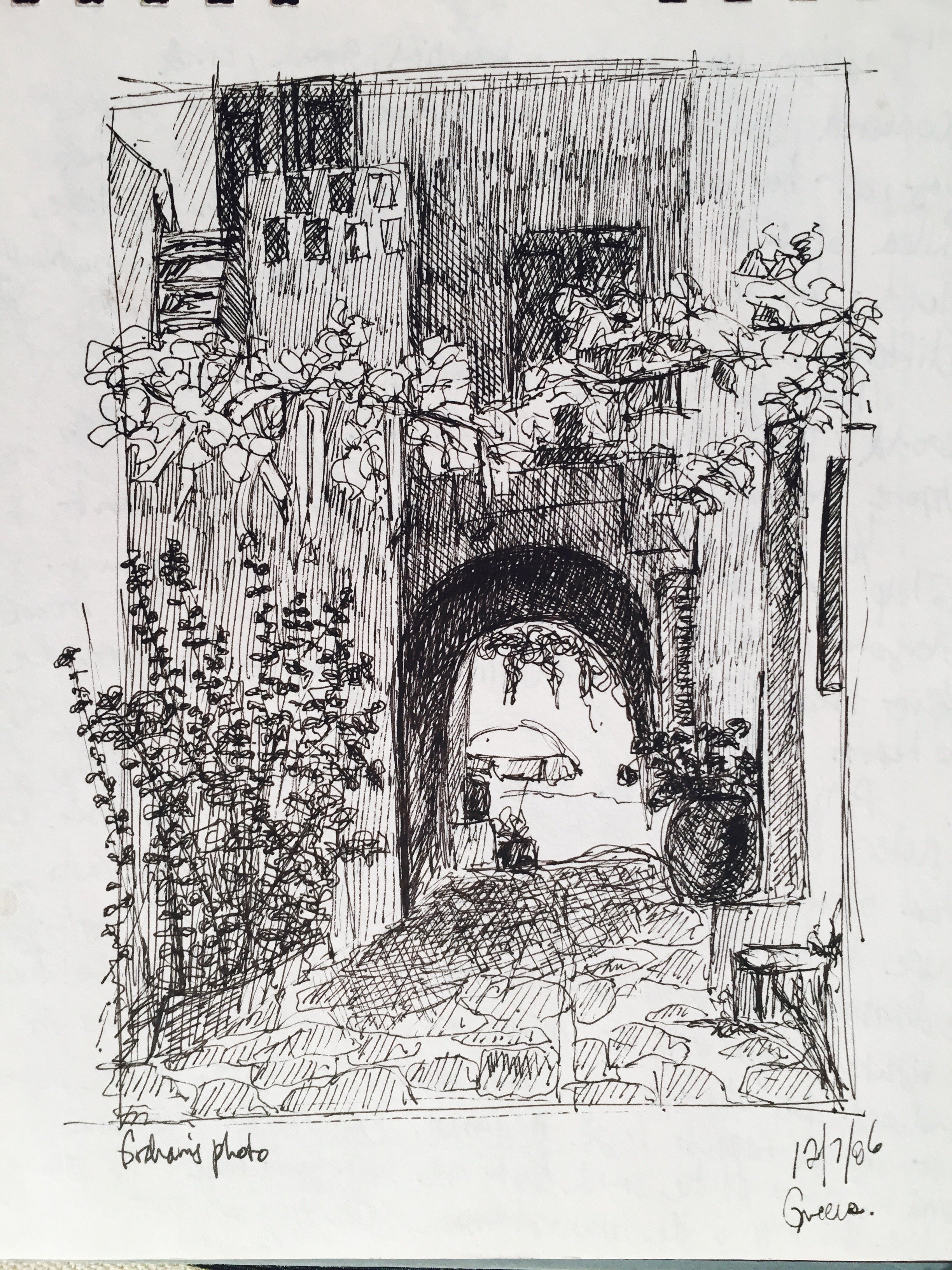
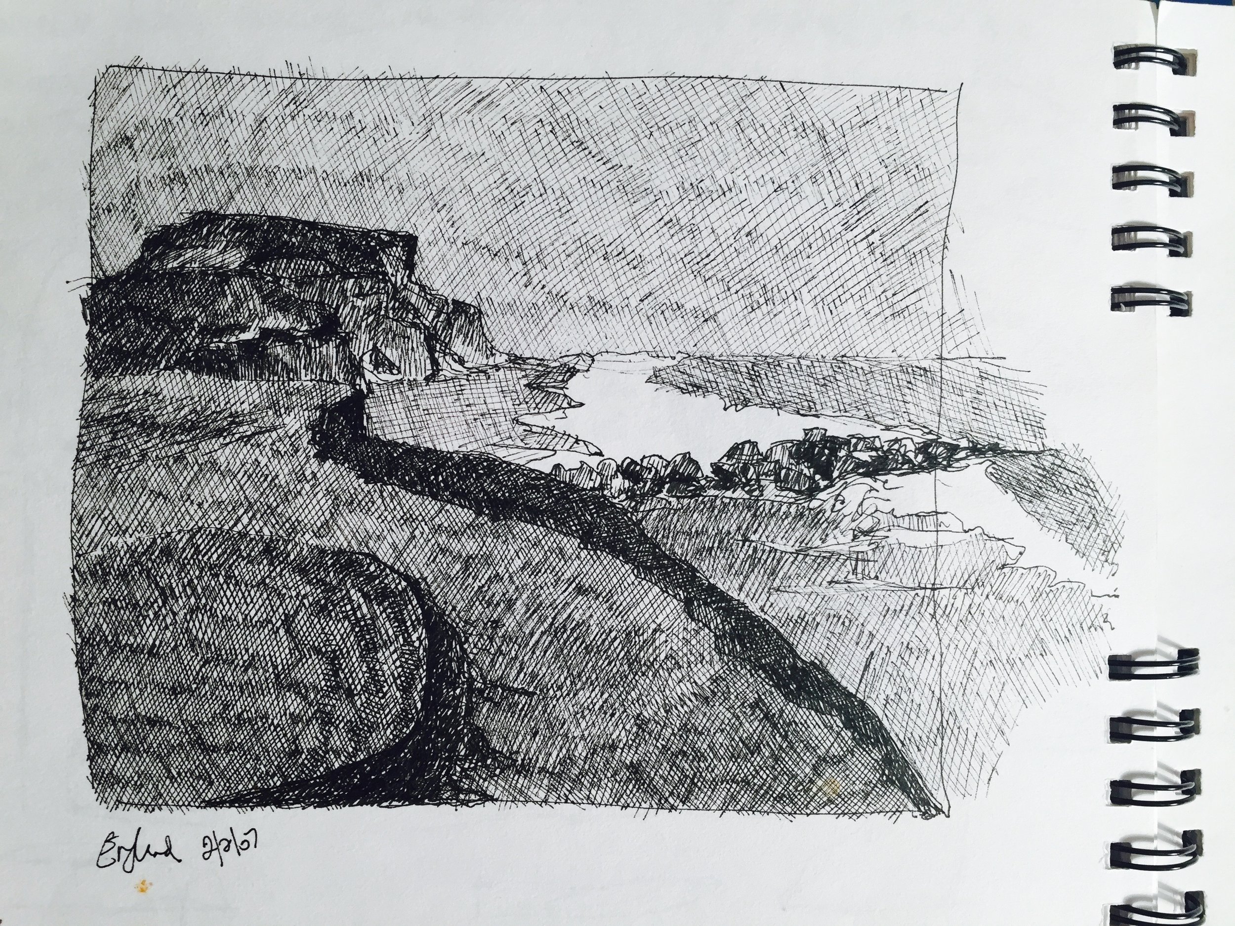
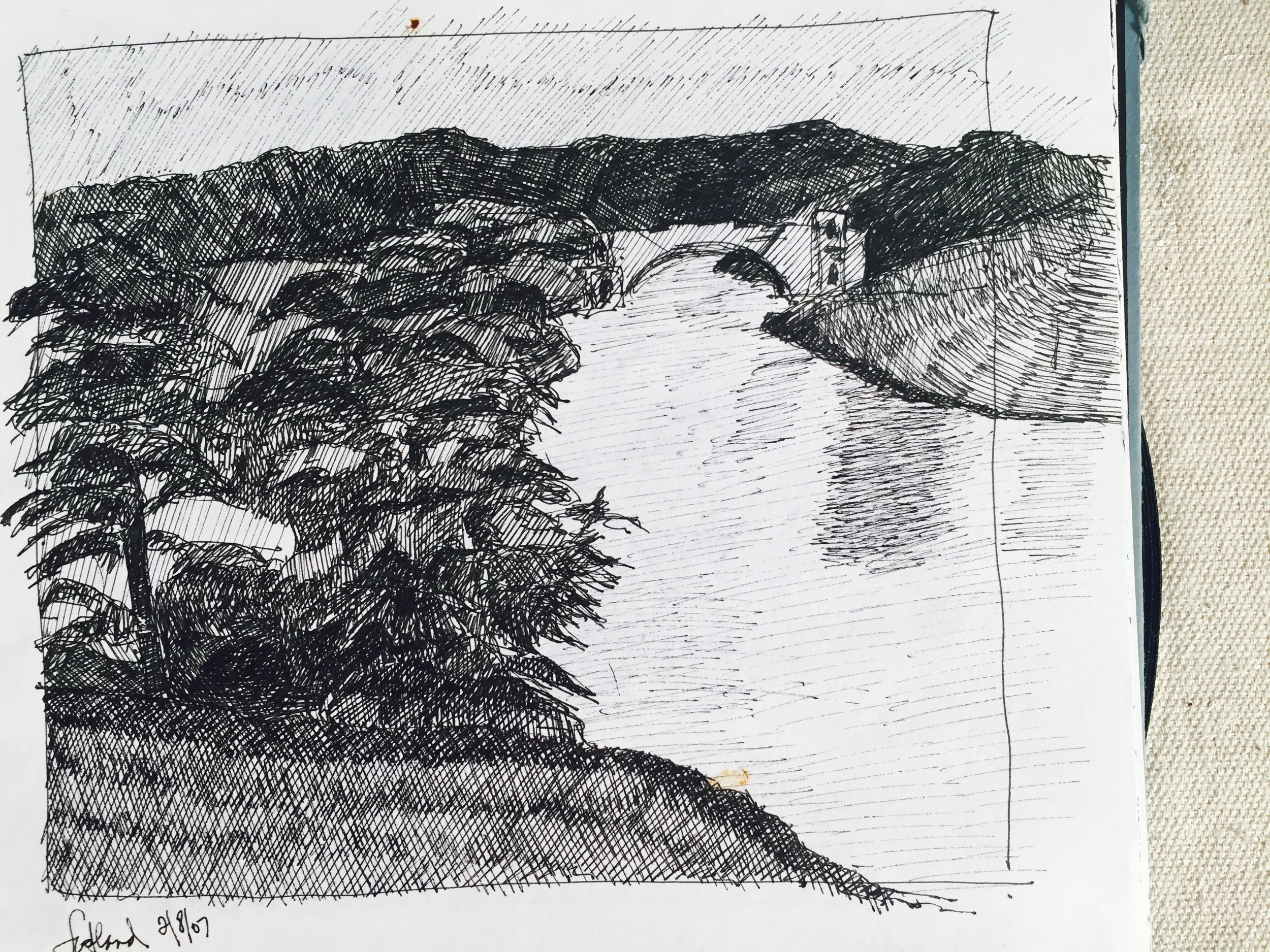
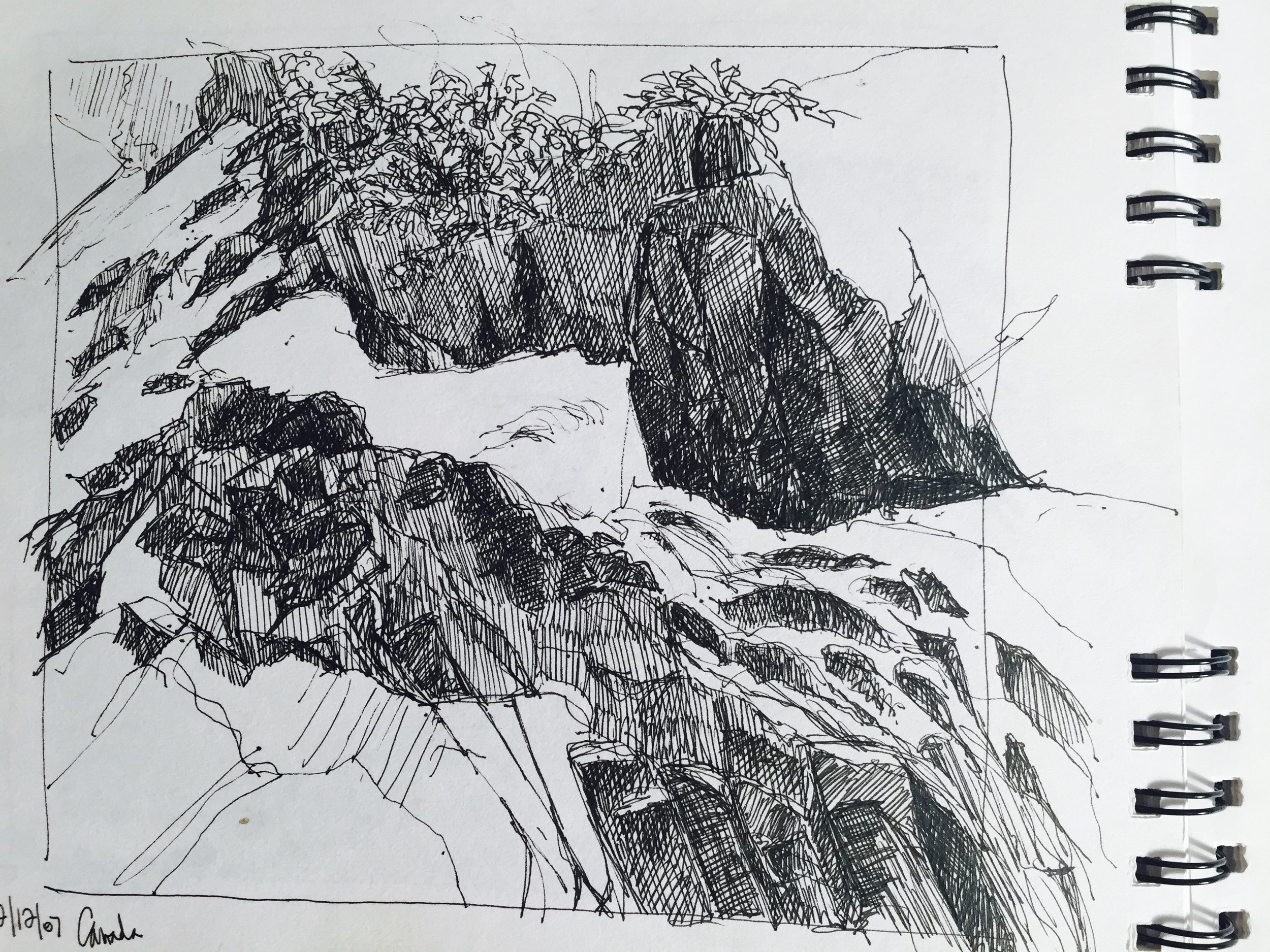
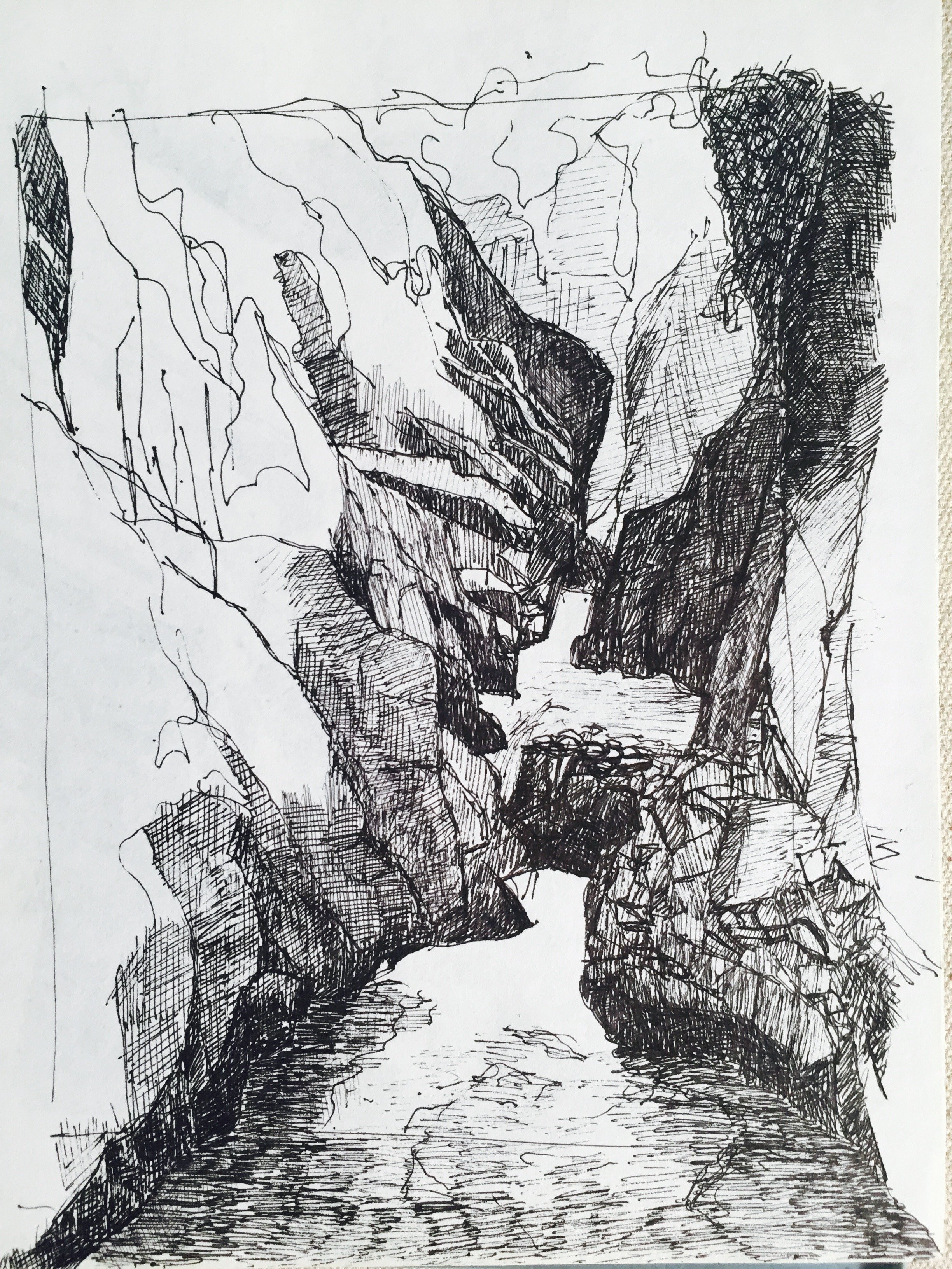
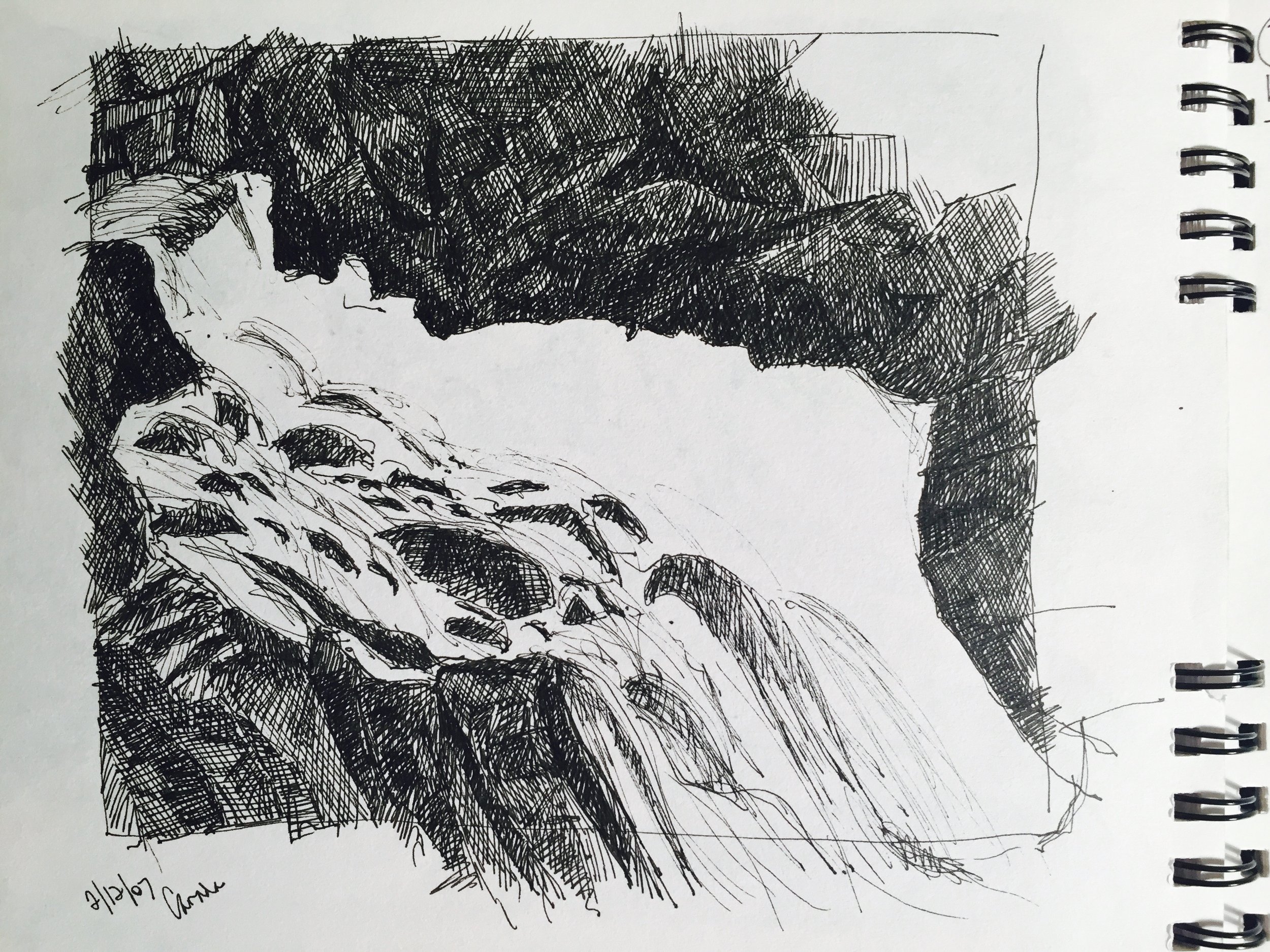
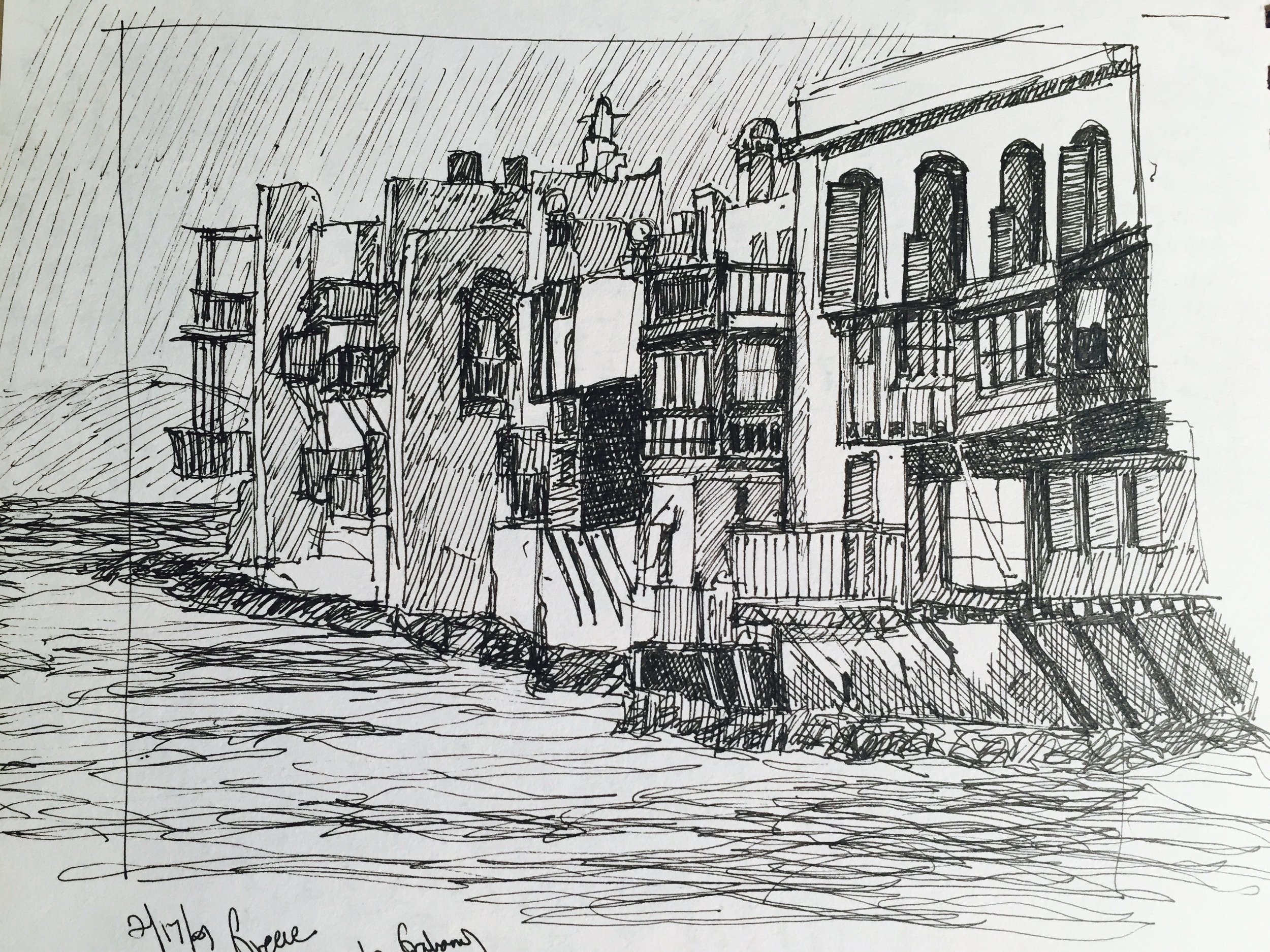
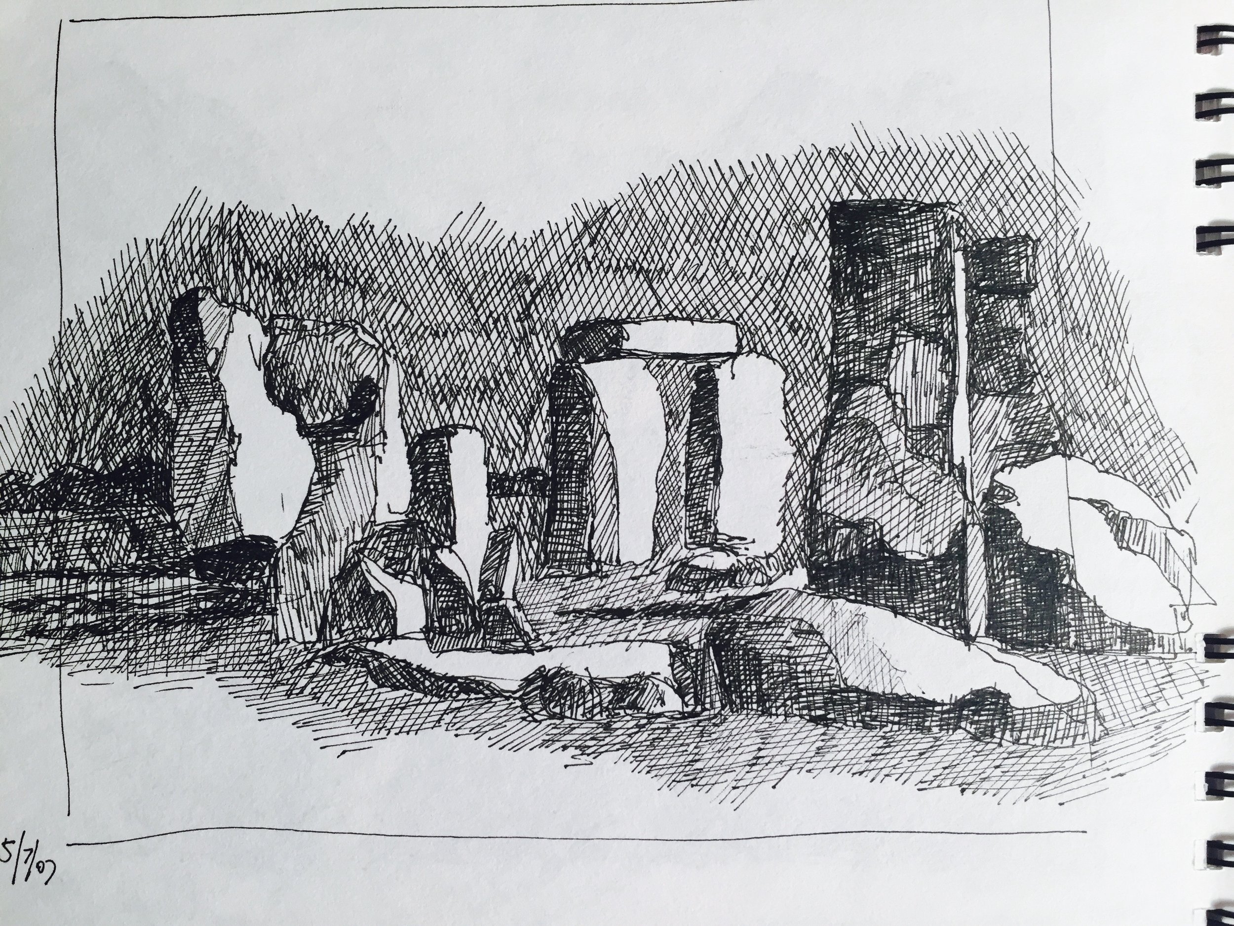
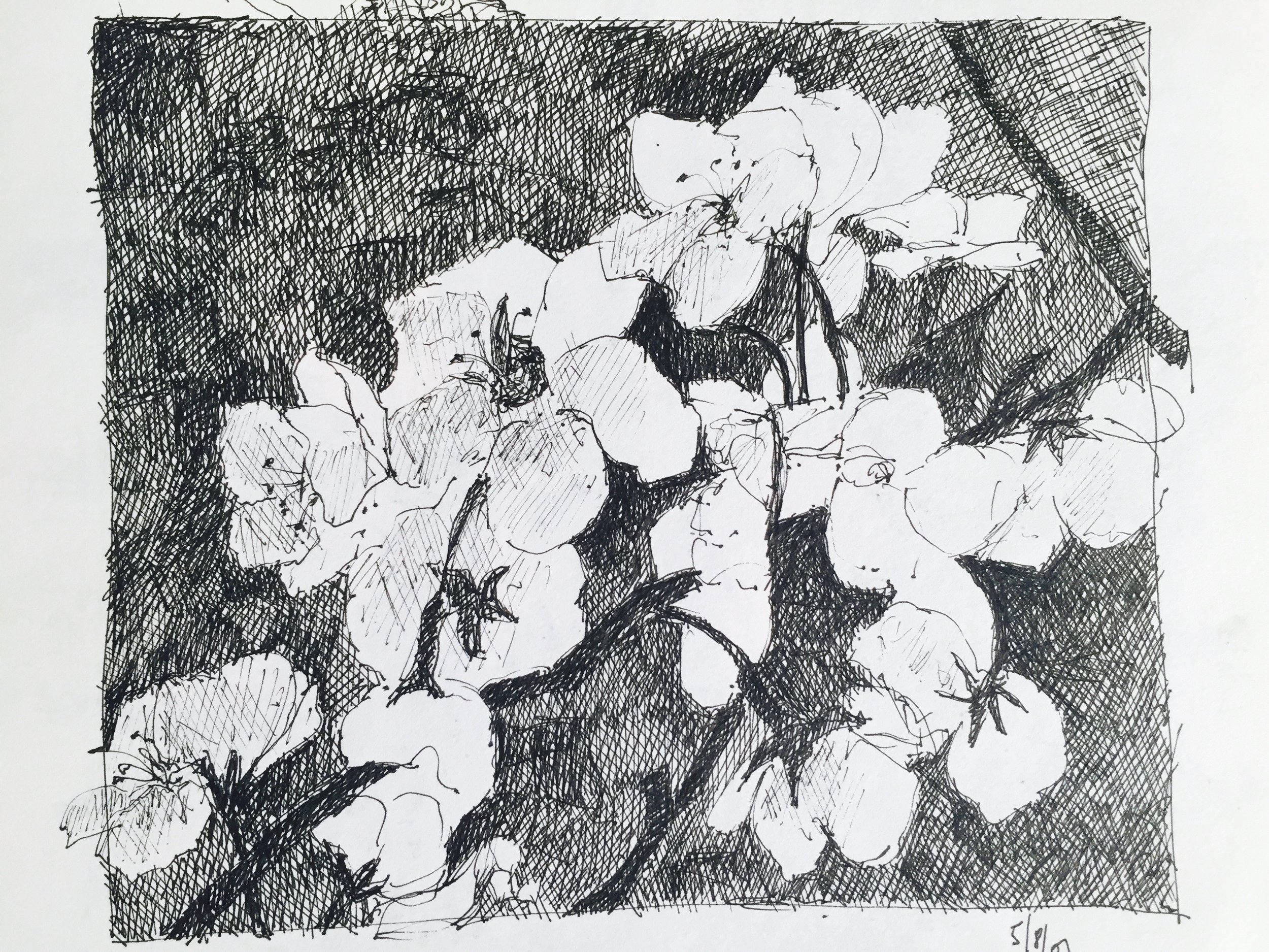
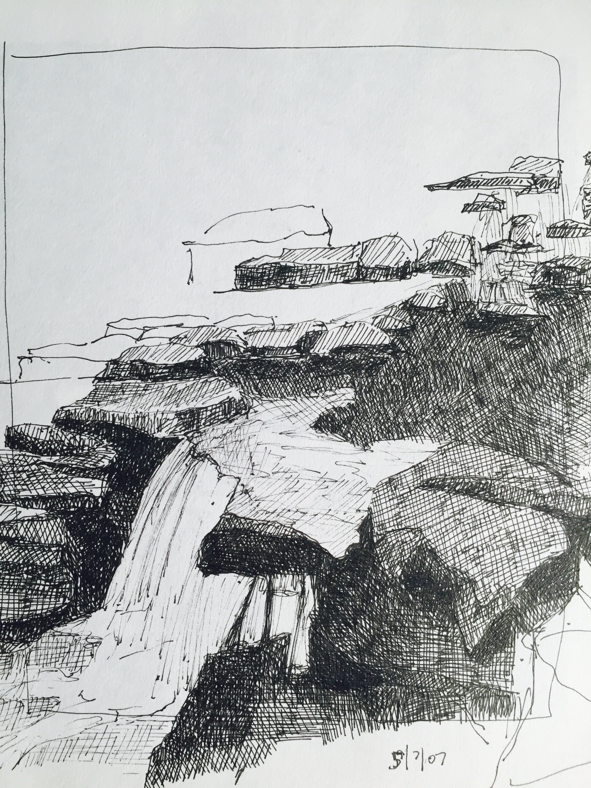
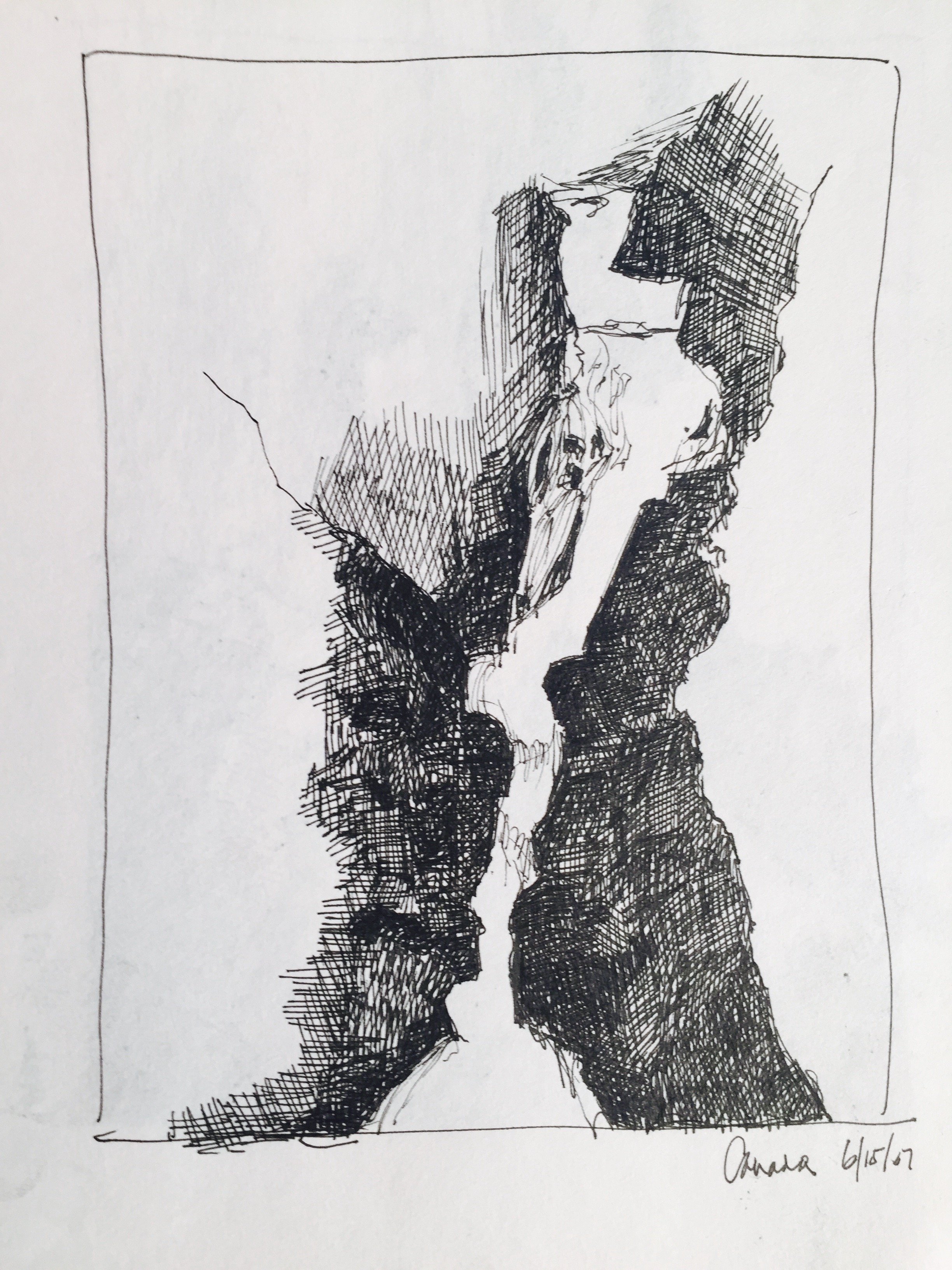
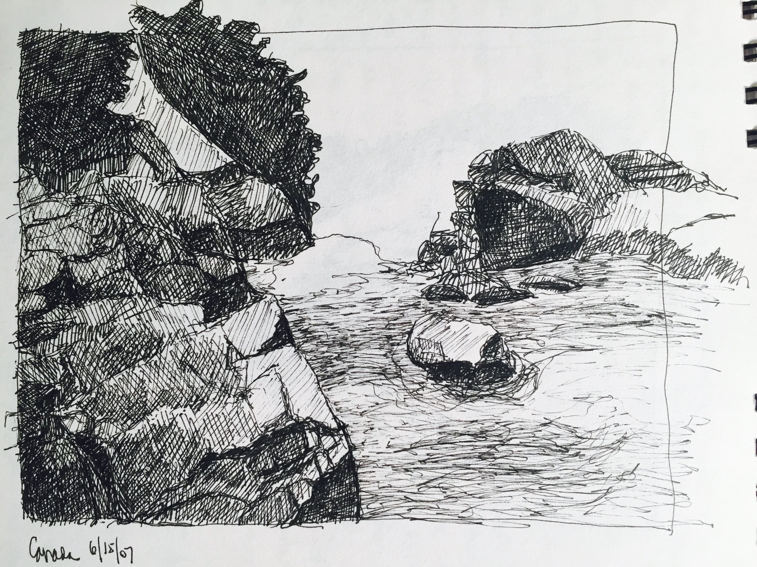
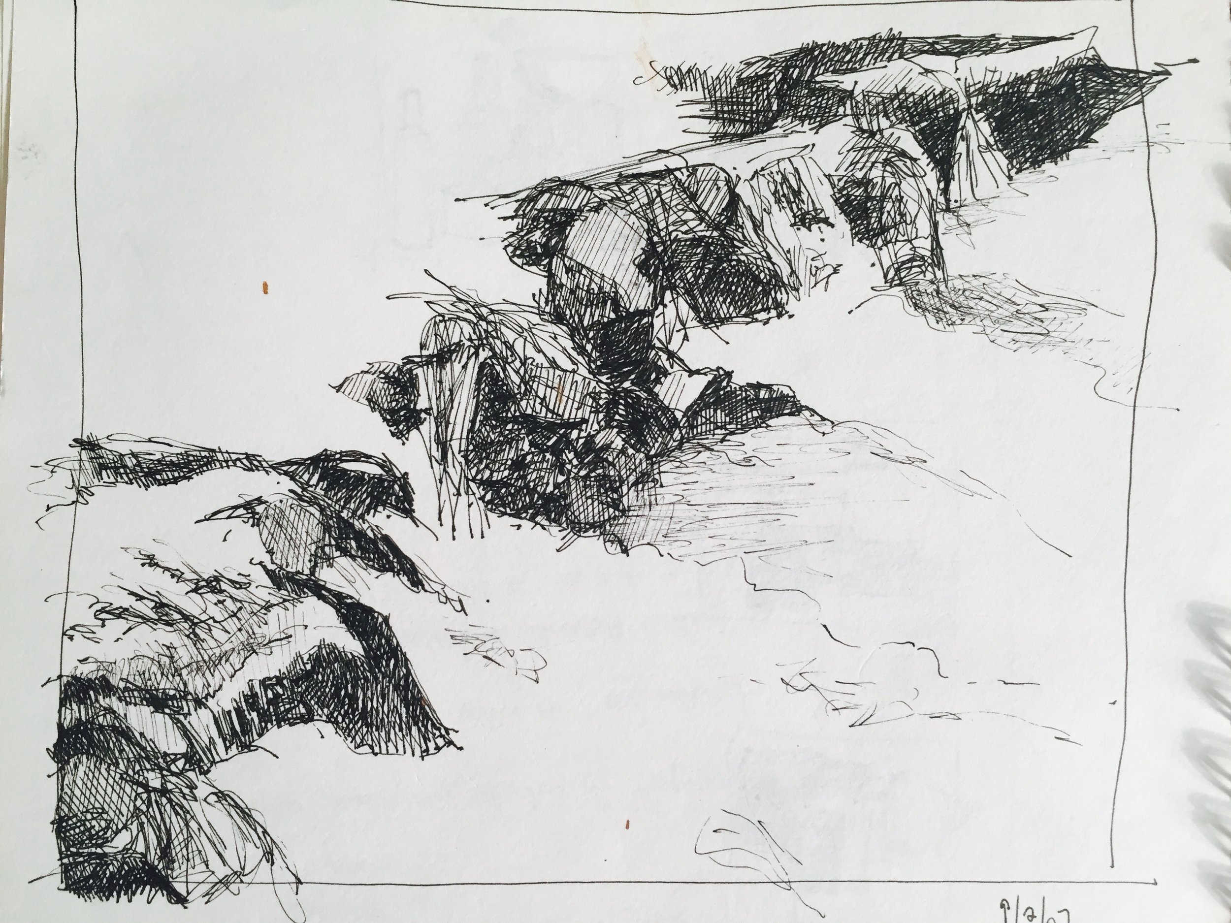
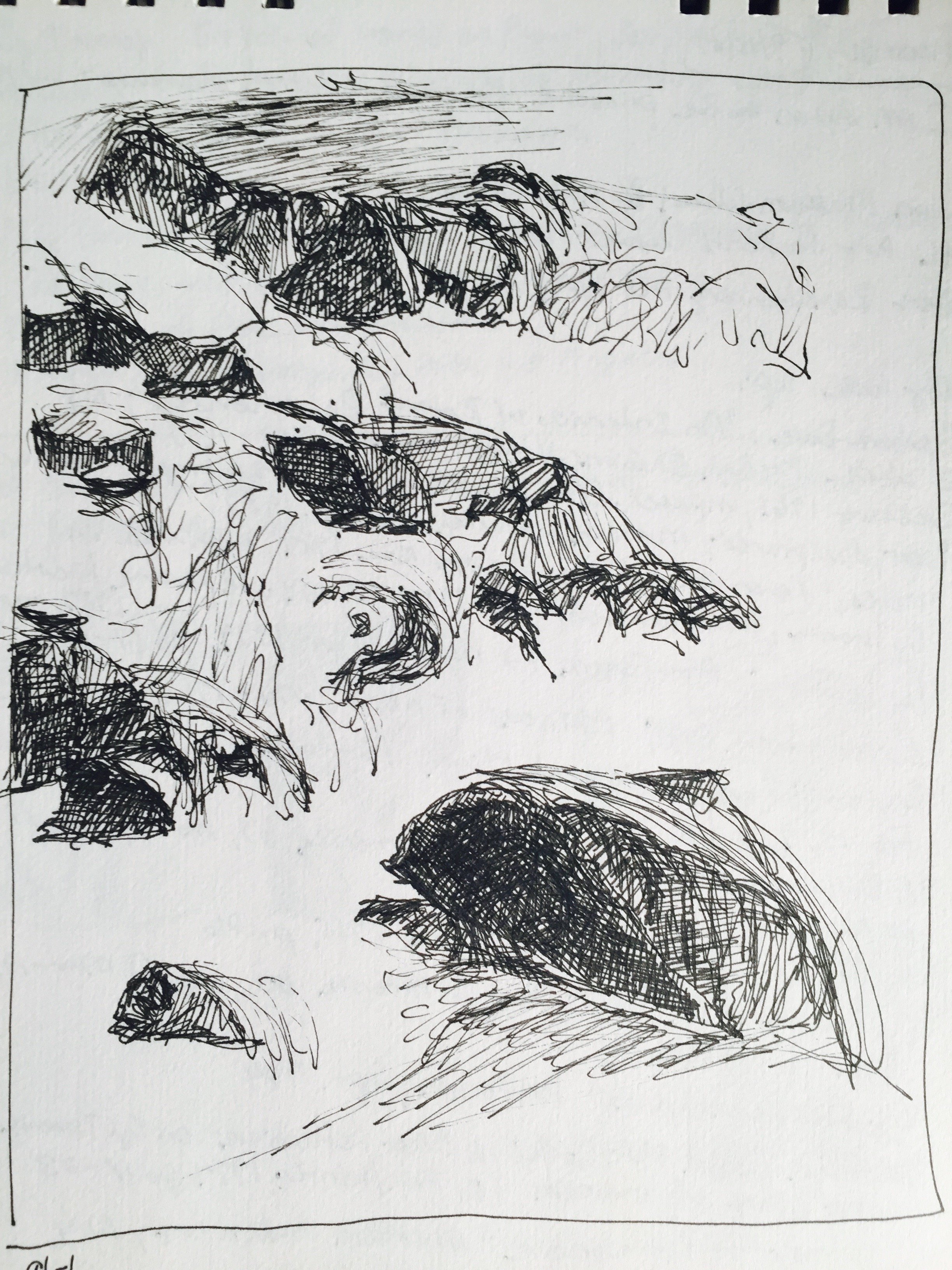
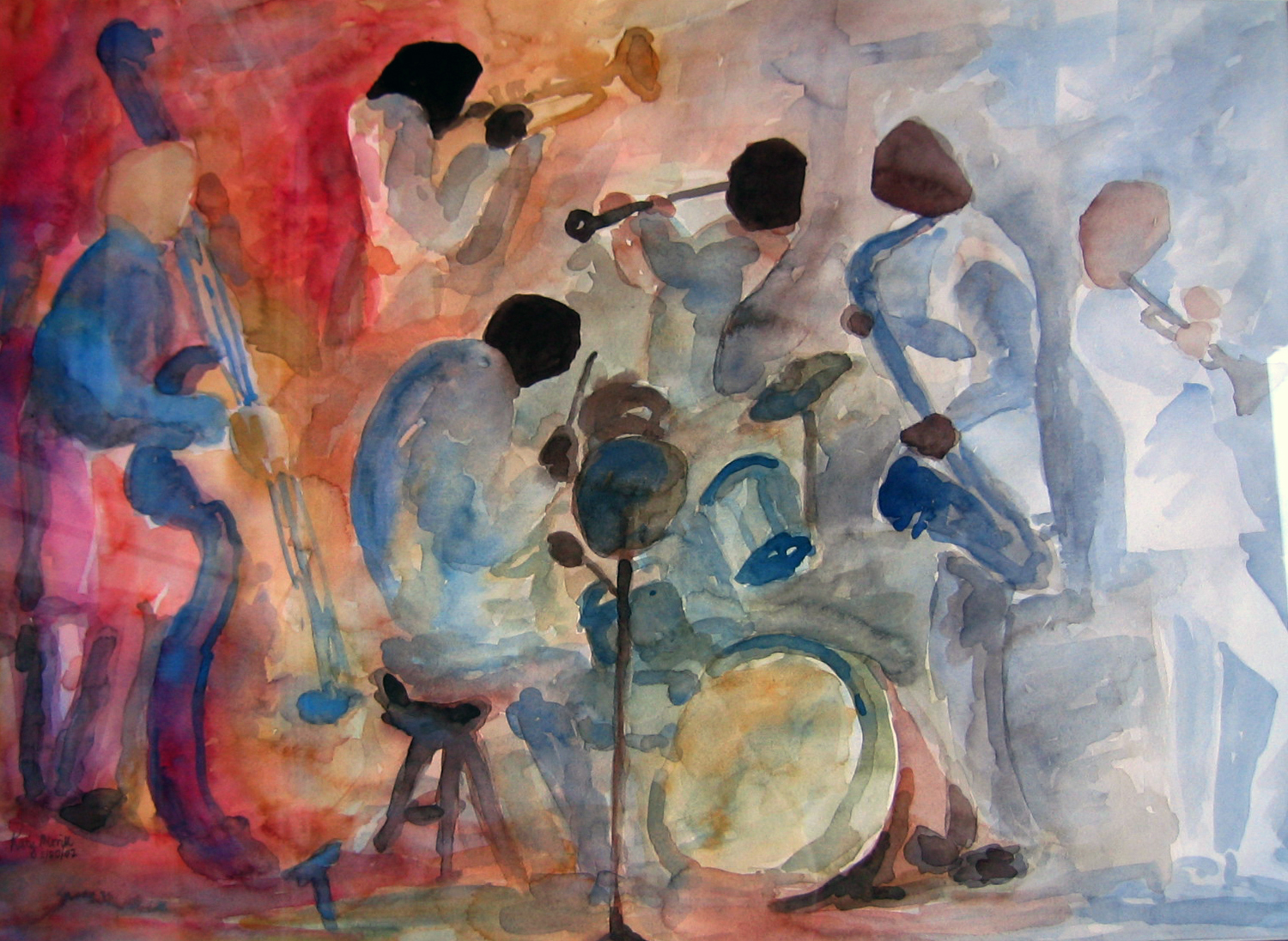
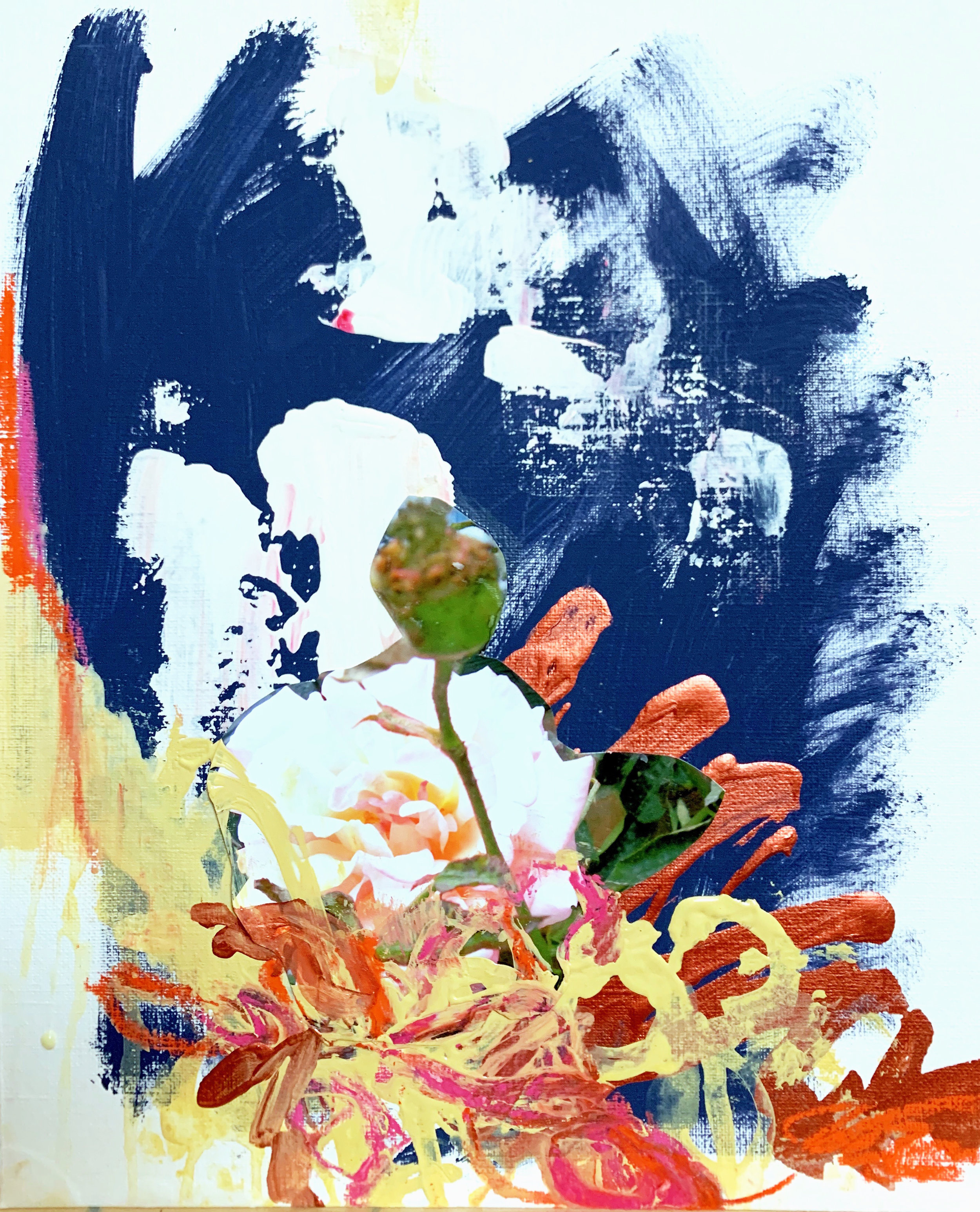
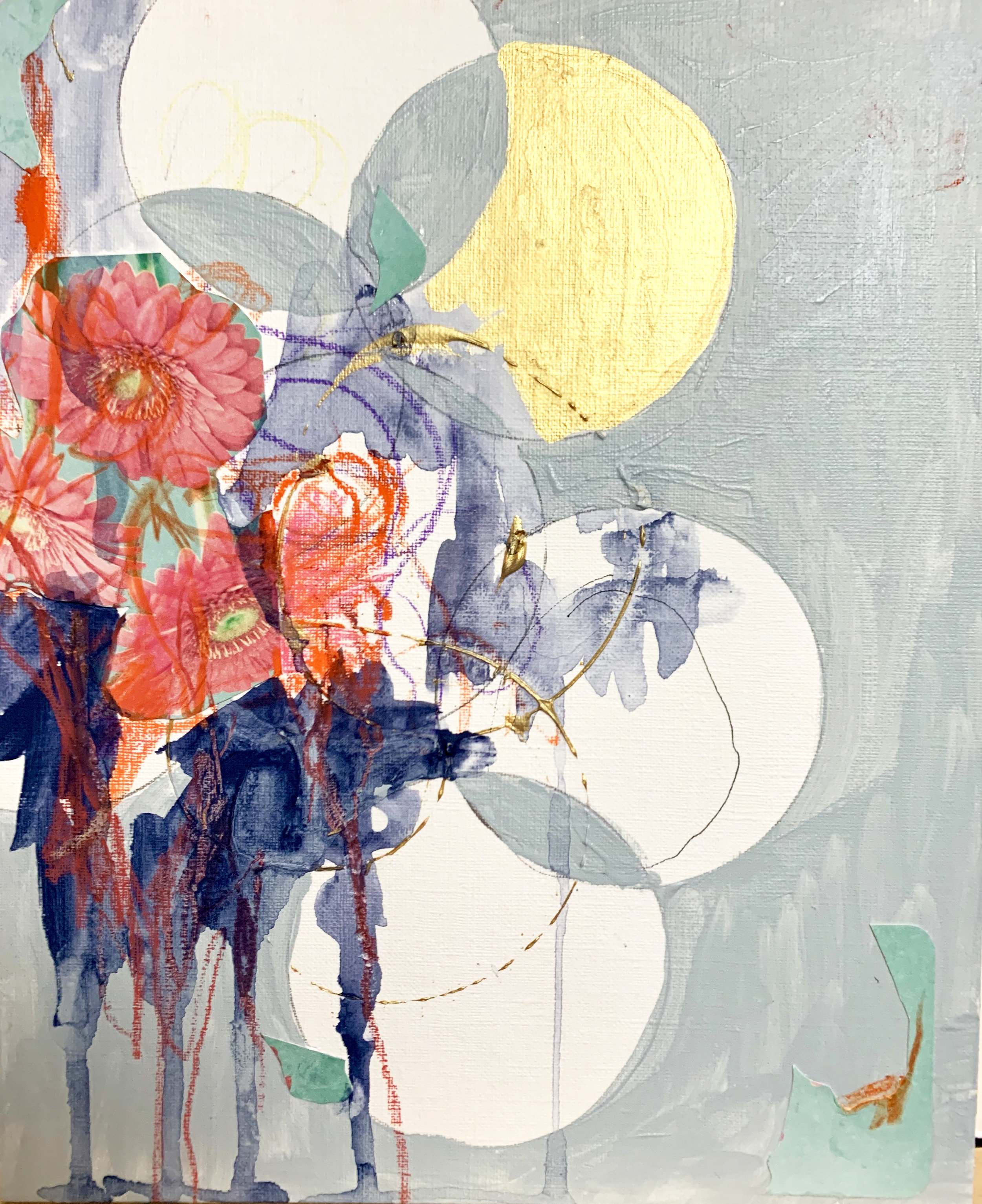
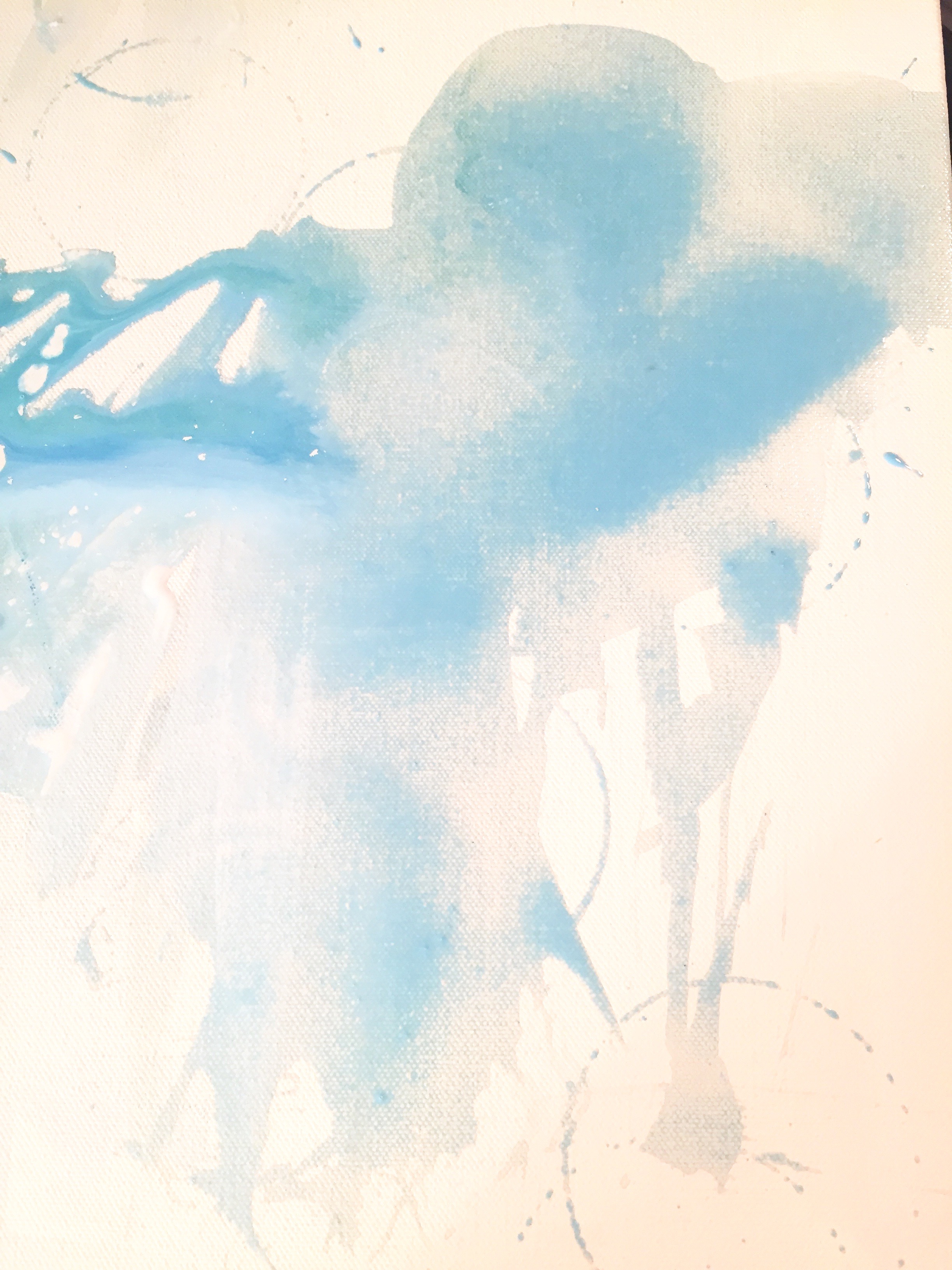
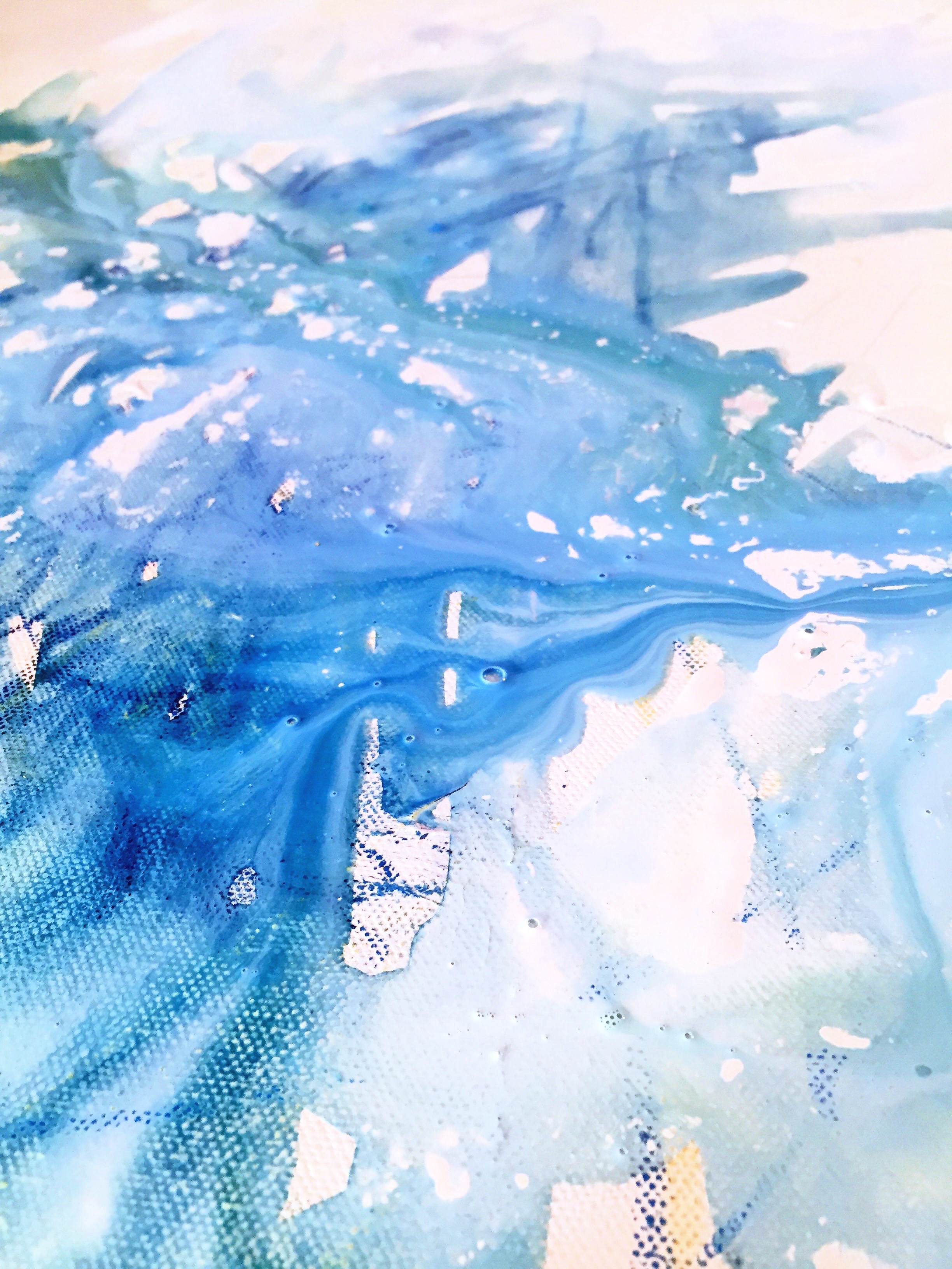
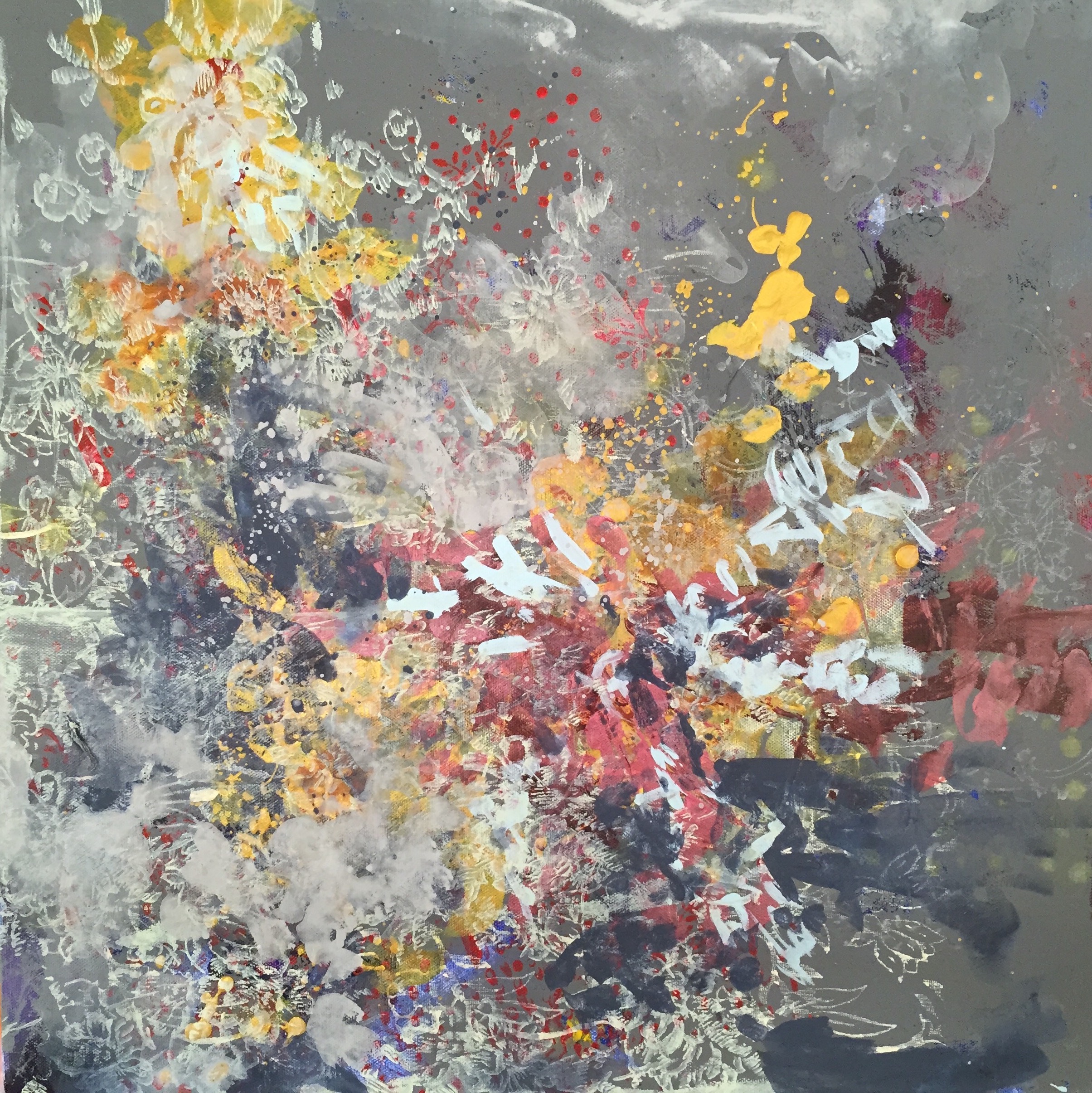
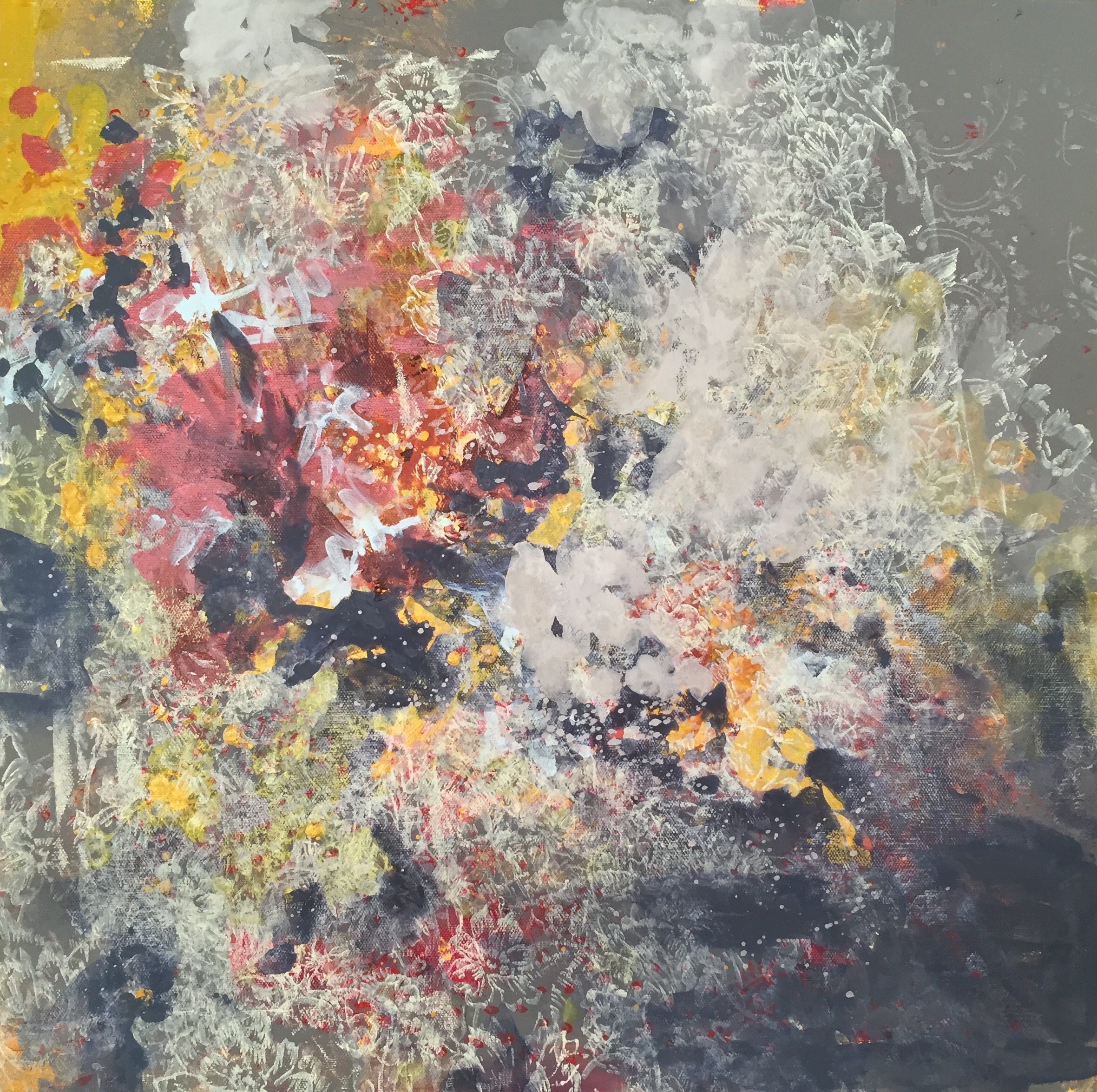
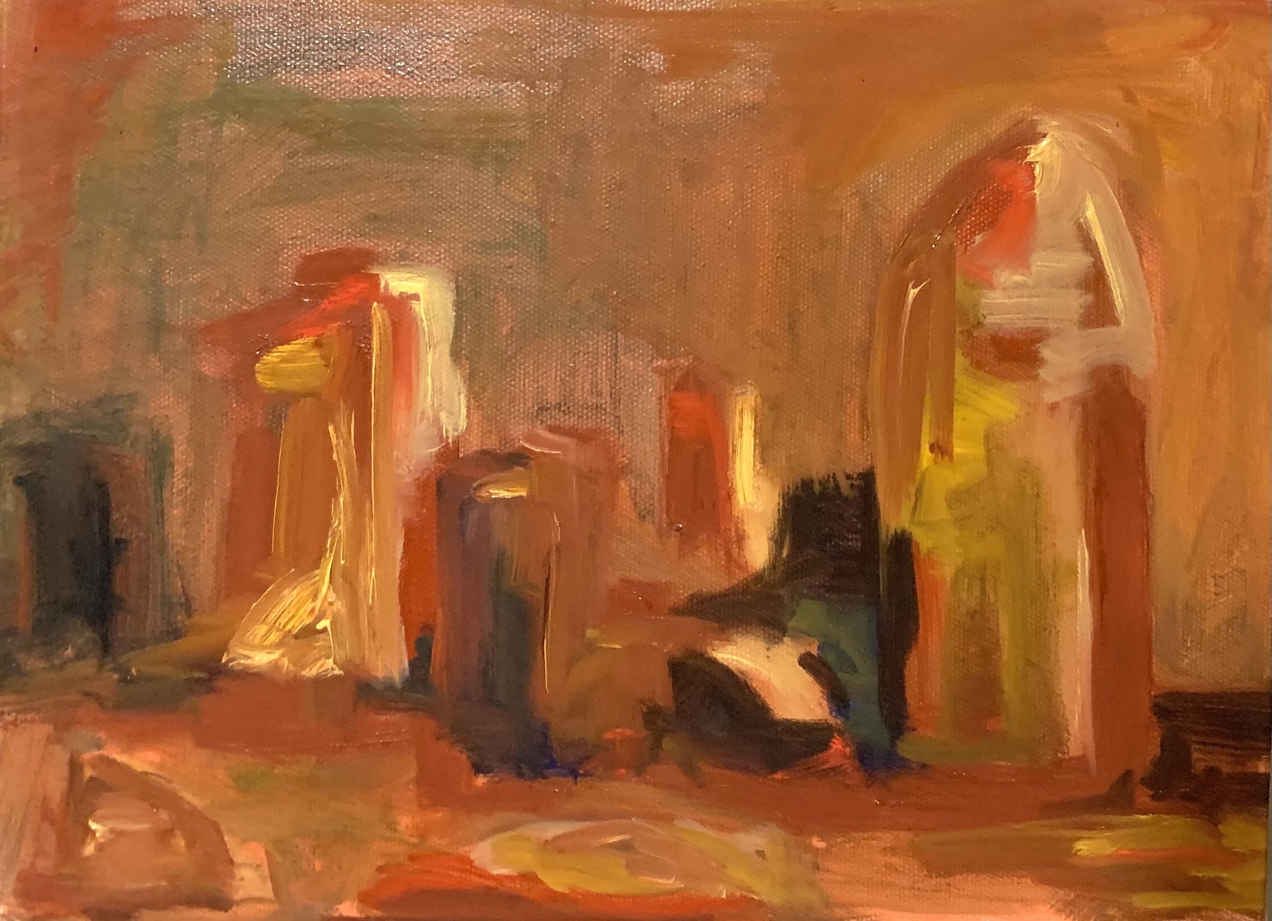
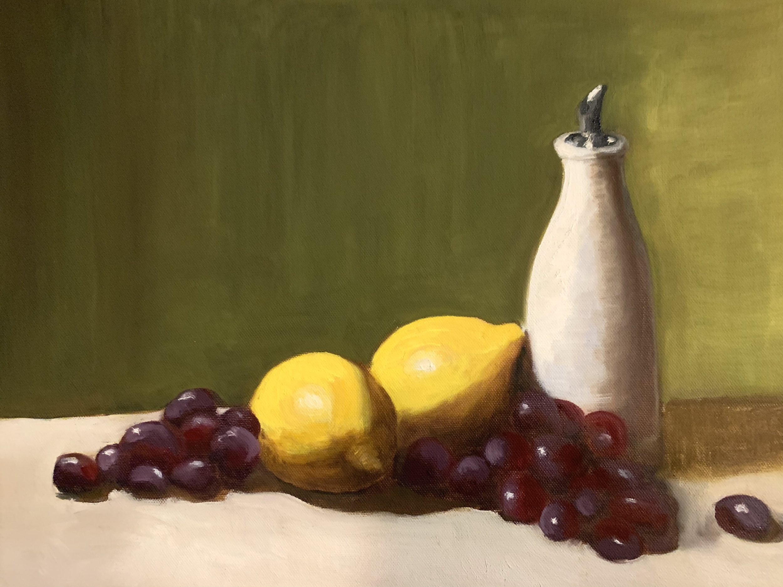
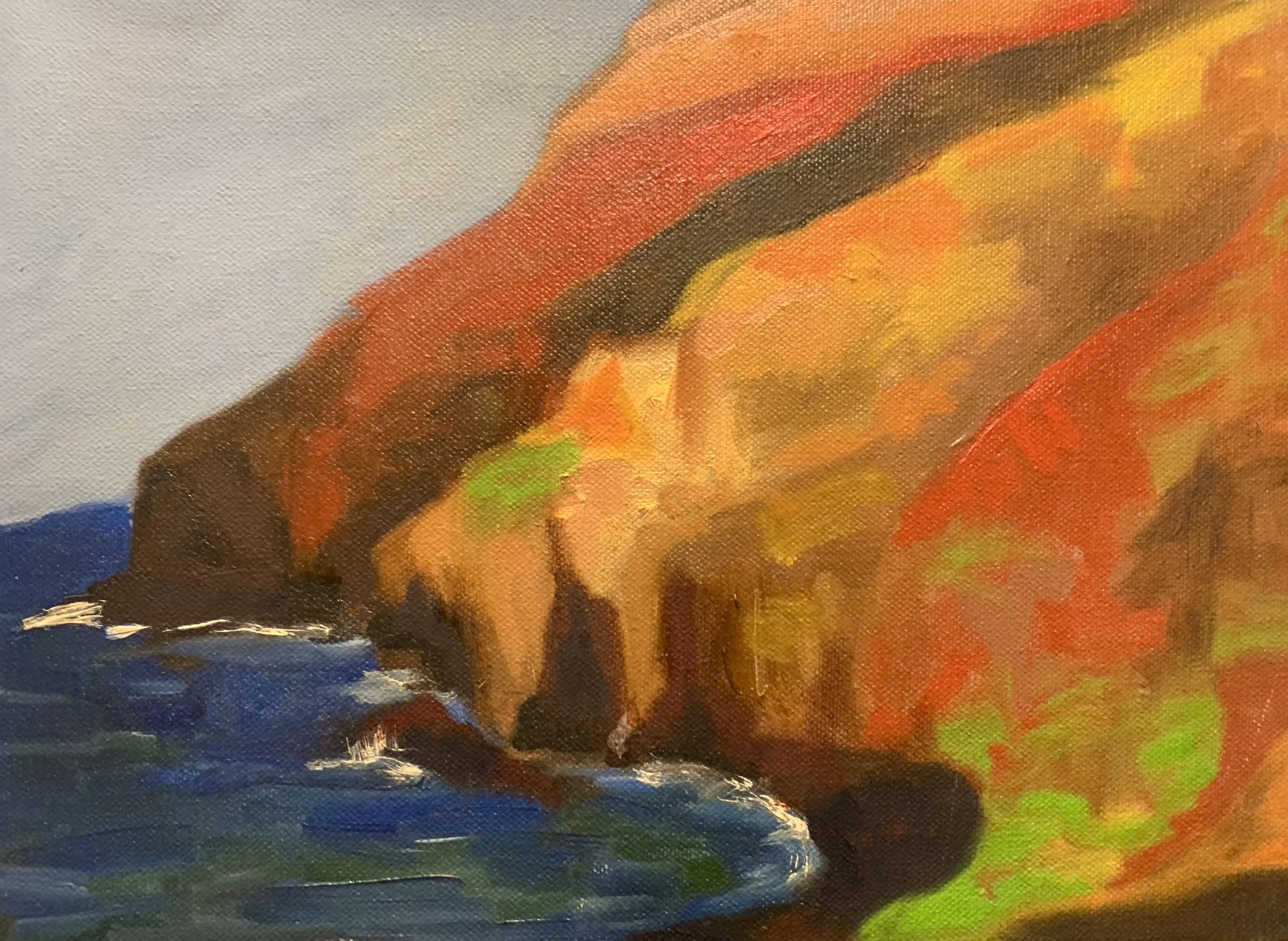
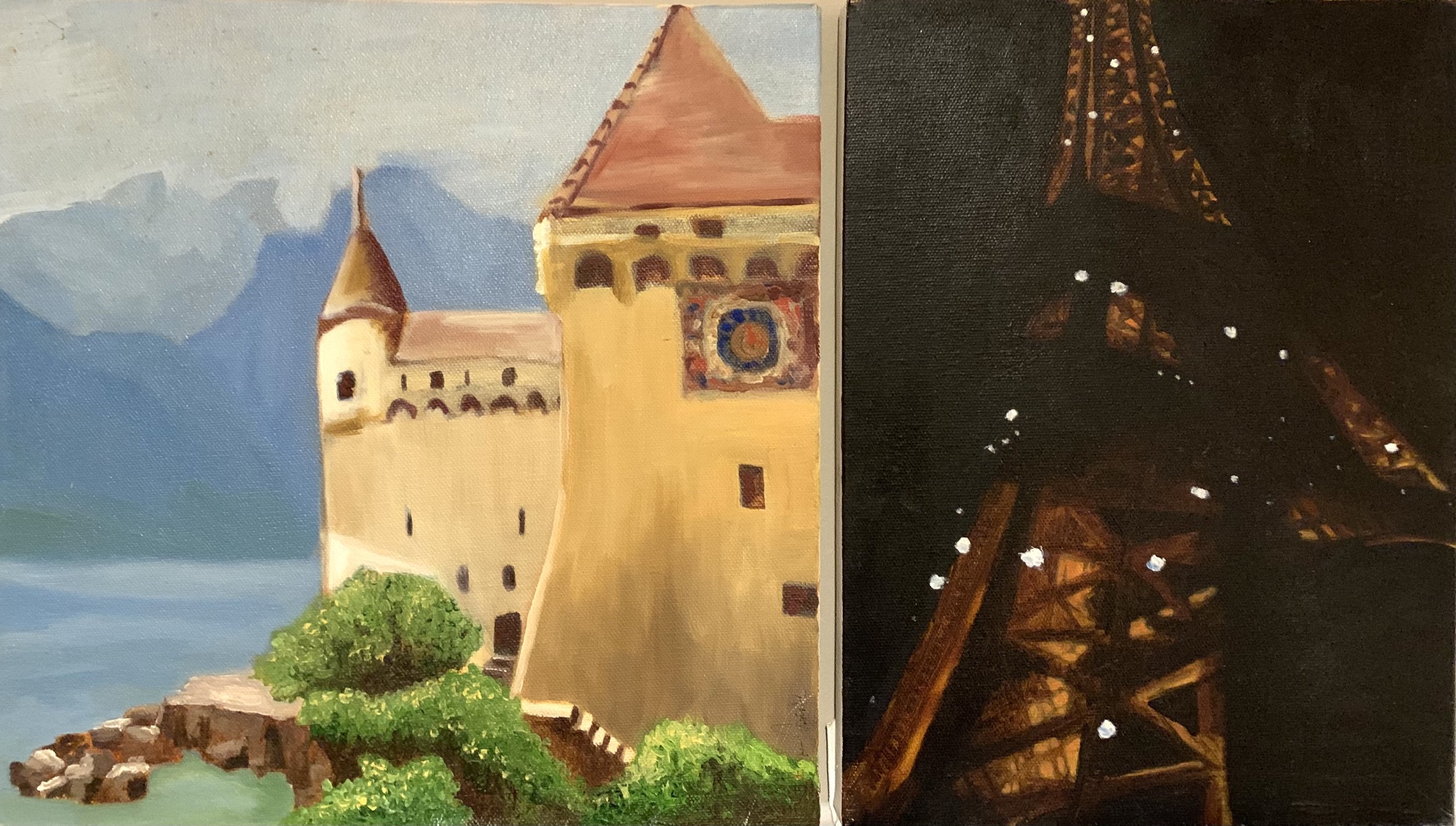
But we were living in downtown Chicago barely scraping by, the prospect of going into debt to pursue . . . something graduate school related was overwhelming. I certainly explored creative outlets ass much as I could since we had a tiny apartment, I could sketch and draw. I finally took an oil painting class which I loved but couldn’t really paint large paintings only tiny ones back at home.
I literally felt like a tiger in a cage. My soul was slowly dying and I didn’t know what to do.
I look back on those years - now over 17 years ago, and definitely feel for myself. I was in the “Wilderness,” feeling very alone and isolated. The city atmosphere was grating on me and my husband and I both hated the cold. It was exiting to live there without a car, taking transportation into downtown to work on the brown El line back to Armitage ini Lincoln Park but it was VERY routine. My personality prefers spontaneity (not too much but a little!) or flexibility, to keep my dreams alive, to keep a spark of life. As I look back I felt like I was barely hanging on. Even though I loved my husband very much, I expected him to support me no matter what, and to appreciate me for everything he was not. A Dreamer married to a Realist is not all that fun LOL.
I did a LOT of soul searching.
In the end, my soul heard me and gave me a way forward . . . .